
Selecting the perfect Teacher’s Day greeting card in Singapore requires balancing thoughtful aesthetics with practical stationery details. A well-chosen card does more than carry a message; it serves as a physical keepsake that reflects appreciation for a educator’s dedication. To find the ideal card, you must consider how the design aligns with the teacher’s personality, whether the paper can handle your preferred writing instrument, and where to source high-quality options locally.
By focusing on key material specifications—such as paper weight, surface texture, and structural integrity—you can ensure your card looks polished and survives the journey in a student’s school bag. Whether you prefer an elaborate pop-up design, a textured premium card, or a clean minimalist layout, understanding these physical characteristics will help you make an informed purchase that stands out on any teacher’s desk.
Key Factors When Selecting a Teacher's Day Greeting Card
Evaluating the physical and practical qualities of a greeting card before purchasing ensures that your gesture of appreciation remains pristine and readable. The foundation of any high-quality card is its paper stock. For a card that feels substantial and premium, look for a paper weight of at least 250 to 350 grams per square metre (gsm). Heavy cardstock prevents the card from bowing when stood upright on a desk and offers the structural integrity needed to survive handling.
Products mentioned in this guide
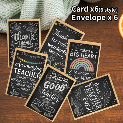
![[Ready stock] Multi Style 10pcs Teachers Day Greeting Cards Gifts for Teachers Decorative Small Cards Handwritten Thank-you and Blessing Message Cards English Version](https://img.lazcdn.com/g/p/94649f07df2c22f050ee5dd01e66302c.jpg_400x400q80.jpg_.webp)
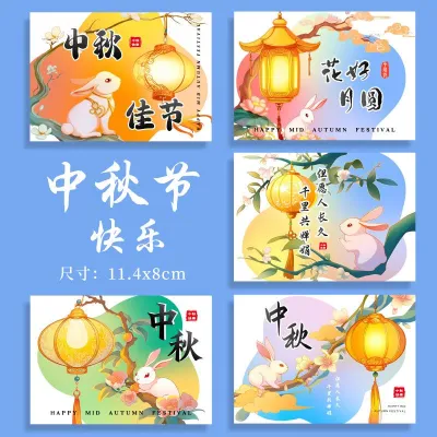
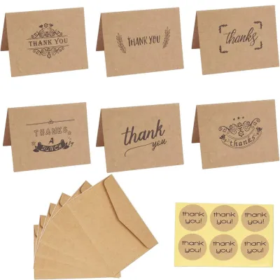
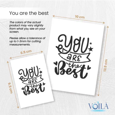
![[SG SELLER] Mini Teachers Day Cards Custom Teachers Day Gift Card Mini Card Customised Thank You Cards Tags](https://img.lazcdn.com/g/p/dd7be998920fe274da8fbcb157d37b58.jpg_400x400q80.jpg_.webp)
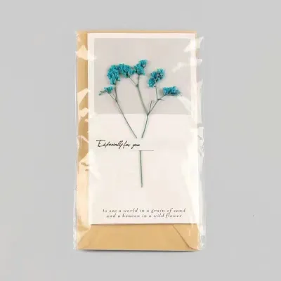
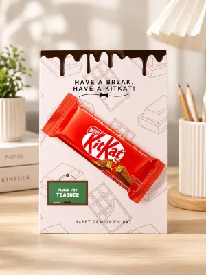
Prices are valid at publication and may change. Please refer to the product page for the latest price.
Paper finish is equally critical because it dictates how your writing ink behaves. Uncoated matte paper is highly absorbent, making it excellent for ballpoint pens, gel pens, and pencil drawings, though it can cause wet fountain pen inks to feather or spread. Coated or glossy finishes offer vibrant color reproduction for printed designs, but they require slow-drying inks or specialized permanent markers to prevent smudging. If you plan to write a lengthy message, look for cards with a matte, uncoated interior surface to ensure smooth writing and fast drying times.
Size and format determine both the visual impact and the practical storage of the card. Standard sizes like A6 (105mm x 148mm) or square formats (typically 140mm x 140mm) are highly versatile and fit easily into standard envelopes. Folded cards provide a traditional opening experience and protect your written message from dust and light, whereas flat postcard-style cards offer a modern, direct presentation. Ensure the card format matches the volume of text you intend to write; a large card with too little text can look empty, while a tiny card might force you to cramp your handwriting.
Finally, never overlook the quality of the accompanying envelope. A premium card should always be paired with an envelope of matching weight, ideally 100 gsm or higher, to prevent the card’s design from showing through. Check the sealing mechanism: peel-and-seal envelopes offer a clean, moisture-free closure that remains secure over time, whereas traditional gummed envelopes require wetting. A snug fit is essential, as an oversized envelope allows the card to slide around and potentially damage its corners during transport.
Greeting Card Designs and Styles to Consider
Aligning the visual tone of a greeting card with your teacher’s personality and your relationship with them makes the gesture feel truly personalized. A card’s design sets the expectation for the message inside, whether it is a formal note of gratitude to a senior mentor or a cheerful, colorful card for a primary school form teacher. By categorizing the main design styles available in Singapore, you can easily narrow down your choices to find a card that resonates.

Different styles offer distinct tactile and visual experiences. From the playful engineering of three-dimensional structures to the quiet elegance of textured cardstock and the artistic simplicity of hand-lettered typography, each style serves a unique purpose. Understanding these categories allows you to select a design that complements your written words perfectly.
Pop-Up and 3D Interactive Cards
Pop-up and three-dimensional interactive cards are designed to create an immediate, memorable visual impact when opened. These cards utilize intricate paper engineering to lift flat designs into miniature sculptures, such as floral bouquets, classroom scenes, or symbolic trees of knowledge. They are particularly popular for younger students to give, as the playful and surprising nature of the card brings an element of joy to the presentation.
When purchasing a 3D card, it is essential to verify the durability of the folding mechanism. Gently open and close the card a few times to ensure the paper hinges move smoothly without catching, bending, or tearing. Look for designs that use sturdy, reinforced paper joints rather than thin, delicate paper bridges that can easily snap under repeated use.
Keep in mind that these structural designs are inherently bulkier than standard flat cards. This extra thickness means they require careful handling inside school bags to prevent the internal mechanisms from being crushed before they reach the teacher. Additionally, because of their weight and volume, they often require specialized, thicker envelopes and may incur higher postage costs if you plan to mail them rather than hand-delivering them.
Premium and Textured Cards
Premium and textured cards are ideal for formal appreciation, milestone years, or honoring long-term mentors who have made a significant impact on your academic journey. These cards rely on tactile luxury and sophisticated printing techniques rather than bright colors or interactive gimmicks. Look for specialty finishes such as metallic foil stamping, deep embossing, or traditional letterpress printing, which add physical depth and a subtle shimmer to the design.
The choice of paper texture plays a major role in the overall feel of a premium card. Cards made from cotton, linen, or laid paper fibers offer a distinct, slightly rough surface that feels exceptionally high-end to the touch. These textured surfaces diffuse light beautifully, giving the printed artwork a soft, organic appearance that standard smooth cardstock cannot replicate.
However, textured papers require careful consideration when it comes to pen compatibility. The uneven surface of linen or cotton paper can catch fine-tipped pens, such as 0.38mm gel pens or delicate calligraphy nibs, leading to skipped lines or ink splatters. For these cards, it is best to use medium-tip ballpoint pens, high-quality felt-tip fineliners, or well-behaved rollerball pens that glide smoothly over the textured ridges.
Minimalist and Hand-Lettered Cards
Minimalist and hand-lettered cards focus on clean layouts, elegant typography, and purposeful negative space. These designs are highly suited for teachers who appreciate modern aesthetics, artistic simplicity, or understated elegance. Instead of busy illustrations, these cards often feature a single, beautifully written phrase of gratitude on the cover, surrounded by clean margins that draw the eye directly to the sentiment.
One of the greatest advantages of minimalist cards is that they typically feature completely blank interiors. This lack of pre-printed text or decorative borders provides ample space for you to write a deeply personalized, handwritten message without feeling restricted by layout boundaries. It allows your own handwriting to become the central design element of the card.
Before purchasing a minimalist card, check the smoothness of the cardstock, especially if you plan to use specialized writing instruments like brush pens, metallic markers, or dip pens for custom lettering. A smooth, satin-finish cardstock allows brush tips to glide effortlessly without fraying, ensuring clean, crisp lines that match the modern aesthetic of the card’s exterior.
Where to Shop for Greeting Cards in Singapore
Finding the right place to buy your Teacher’s Day card in Singapore depends on your timeline, budget, and desire for unique designs. Physical stationery stores and local bookstores remain the most reliable options for inspecting paper quality firsthand. Visiting a brick-and-mortar shop allows you to feel the weight of the cardstock, test the smoothness of the paper, and verify that the envelope matches the card perfectly, making this the ideal route for last-minute purchases.
For those seeking unique, locally inspired illustrations, exploring local independent brand websites and online marketplaces is highly rewarding. Many Singaporean designers create cards featuring local school motifs, humorous classroom puns, or illustrations of iconic local snacks and landmarks. These designs add a warm, culturally relevant touch to your message that mass-produced international cards cannot replicate.
If you are looking for highly sophisticated, artistic, or premium cards, consider visiting museum gift shops or art galleries across Singapore. These retail spaces often stock exclusive card collections featuring high-quality art reproductions, historical prints, and minimalist designs sourced from global design studios. While these cards may carry a higher price point, their exceptional print quality and unique subject matter make them stand out as premium gifts.
When shopping online or through e-commerce platforms, always factor in delivery lead times, especially as Teacher’s Day approaches. Shipping delays can occur during peak seasonal periods, so it is wise to place your orders at least one to two weeks in advance. If you are running short on time, filter online sellers by local shipping options or opt for physical retail stores to guarantee your card arrives well before the school celebrations begin.
Tips for Personalizing Your Teacher's Day Message
Writing a meaningful message is what truly elevates a greeting card from a simple piece of stationery to a cherished keepsake. To write a note that resonates, structure your thoughts into three clear parts: start with a specific expression of appreciation, share a concrete example of how the teacher helped or inspired you, and close with warm wishes for their future. This structure ensures your message feels personal, genuine, and distinct from generic, pre-printed sentiments.
Matching your pen ink to the card’s interior paper color and finish is essential for readability and visual harmony. For traditional white or cream cardstock, classic dark blue, black, or deep forest green inks provide excellent contrast and a professional look. If you have chosen a card with a dark or black interior, you will need to use opaque metallic gel pens or paint markers in gold, silver, or bronze to ensure your writing is clearly visible and does not sink into the paper.
Always allow sufficient drying time after writing your message before folding the card or placing it in the envelope. Wet inks from gel pens, rollerballs, and fountain pens can easily smudge if the card is closed too quickly, leaving unsightly marks on the opposite page. A simple way to verify if the ink is dry is to gently hover a clean, dry finger over the text without touching it, or wait at least two to three minutes after writing the final word.
If you wish to add a little extra touch to your card, consider enclosing small, flat memorabilia that will not damage the envelope or the card itself. A printed class photo, a handmade paper bookmark, or a flat, pressed leaf make wonderful additions that lie completely flat. Avoid adding bulky items like thick keychains, badges, or heavy coins inside the envelope, as these can tear the paper during transit, ruin the envelope seal, or cause the card to bend permanently.
Frequently Asked Questions (FAQ)
What is the standard size for a greeting card envelope?
Greeting card envelopes follow standard international paper sizing systems to ensure a perfect fit. The most common size for standard greeting cards is the C6 envelope, which is designed to hold an A6 card (a standard A4 sheet folded into quarters). For larger cards, a C5 envelope is used to fit an A5 card, while square cards require matching square envelopes, typically measuring 150mm x 150mm.
To find the right envelope size, measure the width and height of your folded card and add approximately 5mm to 10mm of clearance on all sides. This extra space allows the card to slide in and out smoothly without catching on the edges. When shopping, always check the product description to see if a matching envelope is included with the card, as this saves you the hassle of sourcing a separate envelope that fits.
Can I use a fountain pen on any greeting card?
No, you cannot use a fountain pen on every greeting card, as the performance of liquid ink depends heavily on the paper’s composition. Highly porous, uncoated, or low-grade cardstock acts like blotting paper, causing fountain pen ink to bleed through to the back of the page or feather outward, making your handwriting look fuzzy. Conversely, highly glossy or heavily coated papers will not absorb the water-based ink at all, leading to severe smudging and incredibly long drying times.
To avoid ruining your card, always perform a quick ink test before writing your main message. Find a small, inconspicuous area, such as the very bottom edge of the inside back cover or the inner fold of the envelope flap, and write a single letter or draw a small line. Observe how the ink behaves: if it dries within a reasonable time without spreading or bleeding through to the other side, the paper is safe to use with your fountain pen.

Community discussion
Share your experience or ask a question. Comments are reviewed before publication.