
To find the best quality watercolour paints without overspending, beginners should focus on reputable student-grade lines from established manufacturers rather than generic, mass-produced budget sets. The key to balancing affordability and performance lies in selecting a small, highly versatile palette of six to twelve colours that feature clear pigment labeling and reliable lightfastness. By prioritizing paint formulation over sheer quantity, you can avoid the chalky, muddy results typical of ultra-cheap paints while keeping your initial investment low.
Quick Framework for Evaluating Beginner Watercolours
Student-grade watercolours are specifically formulated to offer an accessible entry point for hobbyists and students. Unlike cheap novelty paints, which are often made with dyes and heavy chalk fillers, reputable student-grade lines use real pigments—sometimes blended or substituted with synthetic alternatives—to mimic the behavior of professional paints at a fraction of the cost. This makes them ideal for practicing brush techniques, color mixing, and washes without the fear of wasting expensive materials.
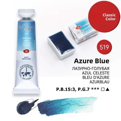
When evaluating these paints, look past the marketing terms on the front of the packaging and turn the tube or pan over to inspect the technical details. A reliable beginner-friendly paint will always display its pigment codes and lightfastness ratings on the label. If a brand hides this information, it is highly likely that the paint contains excessive fillers that will frustrate your learning process.
Products mentioned in this guide
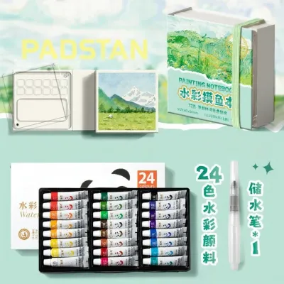
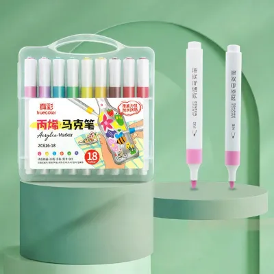
Prices are valid at publication and may change. Please refer to the product page for the latest price.
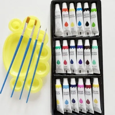
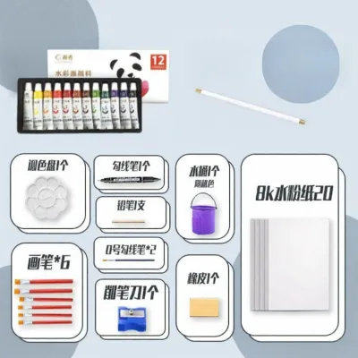
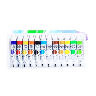
Instead of purchasing massive sets containing dozens of pre-mixed colors, opt for a limited, high-quality palette. A smaller selection of well-formulated paints teaches you the essential skill of color mixing, which is the foundation of successful watercolour painting. It also prevents you from paying for convenience colors that you could easily mix yourself.
Understanding Watercolour Grades and Formulations
To make an informed purchasing decision, it is essential to understand what goes into a tube of watercolour paint. Professional or artist-grade watercolours consist primarily of pure, finely ground pigments bound with high-quality natural gum arabic. This formulation ensures maximum pigment concentration, exceptional transparency, and predictable mixing behavior.

In contrast, student-grade paints lower production costs by introducing fillers, extenders, and synthetic binders. Common fillers like dextrin, barium sulfate, or chalk are added to bulk out the paint, which reduces the overall pigment concentration. Consequently, student-grade paints often require more effort to rewet, look slightly less vibrant when dry, and can become muddy or opaque when multiple colors are layered together.
Despite these limitations, student-grade paints are highly capable tools when used correctly. The key is knowing when to work within their limits and when to strategically upgrade. For instance, highly staining or granulating colors can be difficult to formulate cheaply; therefore, upgrading just your primary blue or a specific earth tone to an artist-grade tube can dramatically improve your mixing results while keeping the rest of your palette budget-friendly.
Observable Quality Checks Before You Buy
Equipping yourself with the ability to read paint labels will save you from costly trial-and-error purchases. The most critical metric to check is the lightfastness rating, which measures how resistant a pigment is to fading when exposed to light. Look for the ASTM (American Society for Testing and Materials) rating on the tube: ASTM I denotes excellent lightfastness, while ASTM II indicates very good lightfastness. In Singapore’s bright, sunlit environments, using paints with poor lightfastness (often labeled as fugitive colors) will cause your artwork to fade or shift color within a matter of months.
Next, examine the transparency and opacity indicators. Watercolour relies on the white of the paper shining through the paint layers to create its characteristic luminosity. Manufacturers usually represent transparency using a small square or circle: an open shape indicates a fully transparent paint, a semi-shaded shape indicates semi-transparent, and a fully blacked-out shape indicates an opaque paint. Beginners should favor transparent paints, as they are much easier to layer without creating a chalky buildup.
You must also decide between purchasing solid pans or liquid tubes. Solid pans are dry blocks of paint housed in small plastic cups. They are highly portable, making them excellent for sketching outdoors in Singapore’s parks or historic streets, and they tend to last a long time because there is minimal waste. However, they require pre-wetting and can be abrasive on your brushes. Tubes, on the other hand, contain moist paint that can be squeezed directly onto a palette. Tubes offer immediate, rich color saturation, are easier on brush bristles, and allow you to mix large washes quickly. They are also highly cost-effective because you can use them to refill empty pans yourself.
Calculating True Value and Managing Your Budget
When shopping for art supplies in Singapore, evaluating the true value of watercolour paints requires looking beyond the initial retail price of a set. To calculate the actual cost-effectiveness, divide the price of the product by its volume in milliliters or weight in grams. For example, a student-grade set of 12 half-pans priced at S$35 might seem like a bargain, but each half-pan only contains about 1.5ml of paint, bringing the total volume to 18ml. In comparison, buying three individual 15ml tubes of essential primary colors for S$8 each totals S$24 for 45ml of paint, which offers a significantly lower cost per milliliter.
Pre-packaged sets often include convenience colors like black, white, or muddy greens that you will rarely use. By purchasing individual tubes or a highly curated primary set, you ensure that every dollar spent goes toward paint that will actually be used on your paper. This approach also allows you to allocate more of your budget toward high-quality paper, which is arguably the most critical component of the watercolour system.
Additionally, consider the long-term maintenance of your palette. Before committing to a specific brand, check if local art supply shops stock individual replacement pans or “open-stock” tubes. If you run out of a single, frequently used color like Ultramarine Blue, you do not want to be forced to buy an entire new set just to replace that one hue. Brands that offer robust open-stock availability in Singapore ensure that you can maintain and replenish your palette affordably over time.
Assembling a Practical and Budget-Friendly Palette
A highly functional and economical way to start is by assembling a split-primary palette. This system consists of a warm and a cool version of each primary color (red, yellow, and blue), allowing you to mix a vast spectrum of clean, vibrant secondary and tertiary colors with only six tubes of paint.
For your yellows, select a warm yellow (such as a red-leaning Hansa Yellow Deep or New Gamboge hue) and a cool yellow (such as a green-leaning Lemon Yellow). For your reds, choose a warm red (such as a yellow-leaning Pyrrol Scarlet or Cadmium Red hue) and a cool red (such as a blue-leaning Quinacridone Magenta or Alizarin Crimson hue). For your blues, pick a warm blue (such as a red-leaning French Ultramarine) and a cool blue (such as a green-leaning Phthalo Blue or Prussian Blue).
To round out this selection without spending too much, consider adding two highly versatile earth tones: Yellow Ochre and Burnt Sienna. These pigments are naturally inexpensive to produce, meaning even student-grade versions perform exceptionally well. They allow you to quickly mix realistic skin tones, shadows, and natural greens without muddying your primary mixtures.
Once you bring your new paints home, perform a series of simple tests on a scrap piece of watercolour paper to understand their unique characteristics.
- Granulation test: Paint a heavily diluted wash of each color and watch if the pigment particles settle into the texture of the paper to create a textured, grainy effect, or if they dry completely smooth.
- Lifting test: Paint a solid stroke of color, let it dry completely, then take a damp, stiff brush and gently scrub a line through the paint to see how easily the pigment lifts off the paper to reveal the white surface underneath.
- Drying shift test: Paint a vibrant patch of color and observe how much lighter or duller it looks once it dries completely, as student-grade paints often experience a more pronounced drying shift than professional lines.
Frequently Asked Questions (FAQ)
Can I mix student-grade and artist-grade watercolours?
Yes, you can freely mix student-grade and artist-grade watercolours on the same palette and within the same painting. Both grades typically use compatible binders, such as gum arabic or synthetic alternatives, allowing them to blend seamlessly. However, keep in mind that mixing a highly pigmented artist-grade paint with a filler-heavy student-grade paint will dilute the overall color strength and transparency of the mixture. For practice pieces, combining grades is an excellent way to stretch your budget, but for finished artworks intended for display, try to minimize the use of student-grade paints that contain fugitive pigments or high filler content to ensure the longevity of your work.
Do I need to buy expensive watercolour paper to match my paints?
Yes, investing in high-quality paper is actually more important than buying expensive paints. Cheap wood-pulp (cellulose) paper does not absorb water evenly, causing your paint to pool, dry with harsh edges, and pill when you attempt to blend or layer. For the best results, look for paper that is labeled as 100% cotton and has a weight of at least 300 gsm (grams per square meter). Cotton fibers absorb water deeply and evenly, allowing you to practice wet-on-wet techniques and lift pigment without damaging the surface. You can save money by purchasing large sheets of cotton paper and cutting them down into smaller sizes for daily practice.
How do I keep my solid watercolour pans from cracking?
Solid watercolour pans can crack over time due to rapid changes in moisture and humidity. In Singapore’s warm and highly humid climate, managing moisture is crucial to preventing both cracking and mold growth. To prevent cracking, mist your dry pans lightly with water a few minutes before you begin painting to allow the binder to soften gradually, rather than scrubbing dry paint with a stiff brush. Once you are finished painting, leave your palette open in a well-ventilated room to dry completely before closing the lid. Storing a damp palette in a dark, enclosed drawer can trap moisture and encourage mold, while exposing it to direct, harsh sunlight can dry out the binder too quickly and cause deep cracks.

Community discussion
Share your experience or ask a question. Comments are reviewed before publication.