
Selecting your first metallic watercolor set can be an exciting yet overwhelming step into the world of shimmering art. The captivating luster of metallic paints offers a unique way to add highlights, calligraphy, and magical effects to your illustrations. However, many beginners fall into the trap of purchasing massive, low-quality palettes containing dozens of chalky, barely reflective colors. To get the best results, you should focus on a few key characteristics rather than sheer quantity.
When evaluating a starter set, prioritize the following core decision dimensions:
- Pigment Type: Look for sets that clearly state whether they use natural mica or synthetic pearlescent pigments, as this determines the smoothness and intensity of the shine.
- Format: Choose between half-pans (best for portability, detailed work, and minimal waste) and tubes (best for large washes and mixing custom metallic fluids).
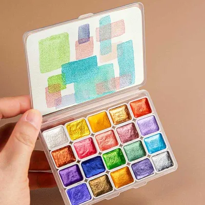
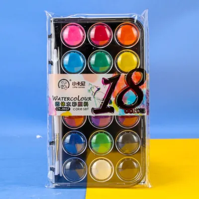
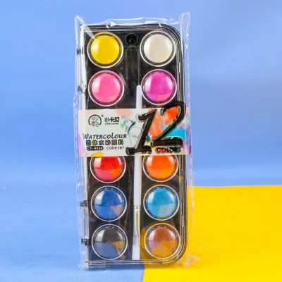
- Palette Size: A curated selection of 12 to 18 colors is the ideal "sweet spot" for beginners, balancing variety with quality and cost.
- Paper Compatibility: Ensure you pair your paints with heavy-weight paper (at least 300gsm) to handle the water required to reactivate these dense pigments.
Evaluating Pigment Quality and Metallic Shine
To understand what makes a high-quality metallic watercolor, it helps to understand how these paints are made. Standard watercolors rely on transparent organic or inorganic pigments that stain or settle into the paper fibers. Metallic watercolors, on the other hand, contain tiny reflective platelets suspended in a binder. These platelets act like microscopic mirrors, bouncing light back to the viewer and creating a distinct shimmer.
Products mentioned in this guide
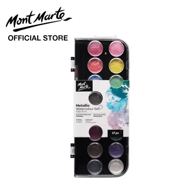
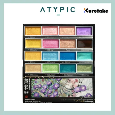
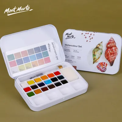
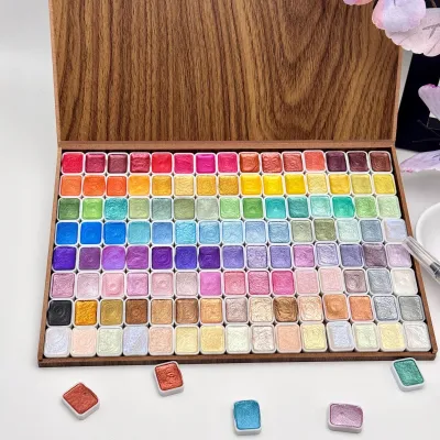
Prices are valid at publication and may change. Please refer to the product page for the latest price.
The visual success of your painting depends heavily on the size, purity, and composition of these reflective particles. Low-quality sets often use coarse, unevenly ground glitter that sits awkwardly on top of the paper and flakes off easily. High-quality sets use finely milled pigments that create a smooth, continuous metallic sheen, mimicking the appearance of real metal foil.
Mica vs. Synthetic Pearlescent Pigments
Most metallic watercolors rely on mica, a naturally occurring silicate mineral that is ground into a fine powder and coated with metal oxides like titanium dioxide or iron oxide. Natural mica pigments tend to offer a more subtle, earthy, and organic shimmer. They often exhibit beautiful granulation, where the heavier mineral particles settle into the textured valleys of your paper, creating a rustic, dimensional effect.
In contrast, synthetic pearlescent pigments (often made from synthetic fluorophlogopite) provide an incredibly bright, uniform, and high-intensity metallic shine. Because these particles are engineered in a laboratory, they are perfectly flat and consistent in size, resulting in a smoother application with fewer visible flecks. Synthetic pigments are also used to create interference or color-shifting watercolors, which change hue depending on the angle of the light.
When shopping for a starter set, avoid relying solely on poetic color names like “Imperial Gold” or “Starlight Silver.” Instead, check the packaging or the manufacturer’s product description for the actual pigment composition. Reputable brands will list the specific ingredients, such as natural mica (often designated as PW20) or synthetic substrates, giving you a clear indication of how the paint will behave on paper.
Binder Quality and Particle Suspension
The binder is the vehicle that holds the pigment particles together in the pan or tube and adheres them to the paper once dry. Traditional watercolors use gum arabic, a natural sap from the acacia tree, often mixed with a plasticizer like glycerin or honey to keep the paint pliable. Because metallic pigments are significantly heavier than standard organic pigments, the ratio of binder to pigment must be precisely calibrated.
If a manufacturer uses too little binder, the heavy metallic particles will not adhere properly to the paper. Once the paint dries, you will notice a dusty residue that rubs off on your fingers or smears across your artwork. Conversely, if there is too much binder, the metallic particles will be buried under a thick, glossy layer of dried gum, severely dulling the reflective shine and making the paint look plasticky.
Fortunately, you can perform a few simple, observable tests to evaluate binder quality before committing to a large project:
- The Dry Pan Crack Test: Inspect the dried paint in the pans. While minor hairline cracks are normal for hand-poured watercolors, deep, crumbling fissures indicate a lack of plasticizer or a poor binder formula. If the paint is crumbling, it may fall out of the pan during travel.
- The Reactivation Test: Place a single drop of clean water onto the dry paint. A high-quality metallic watercolor should reactivate within 30 to 60 seconds, melting into a creamy, smooth pool of paint. If you have to scrub the pan aggressively with your brush to lift any pigment, the binder is too hard or low-quality.
- The Tube Separation Test: If you are using tubes, squeeze a tiny drop onto a test palette. If a clear, yellowish liquid runs out first, followed by a dry, dense clump of metallic paste, the binder has separated. While a small amount of separation is normal, severe separation requires you to vigorously knead the tube before opening it.
Pan vs. Tube: Choosing the Right Format for Your Workflow
Metallic watercolors are primarily sold in two formats: solid dry pans or wet tubes. Deciding between these formats depends on your preferred painting style, how often you travel with your supplies, and the physical space available in your creative workspace.

Both formats have distinct advantages and physical handling requirements. Understanding these differences will help you choose the setup that aligns naturally with your daily creative routine.
Half-Pans and Full-Pans for Portability
Dry watercolors are housed in small plastic cups known as pans. Half-pans typically hold about 1.5ml to 2ml of paint, while full-pans are twice that size. For beginners, half-pans are generally the preferred choice for a starter set. They allow you to access a wide variety of colors within a very compact, budget-friendly footprint.
Half-pans are incredibly convenient for casual painting, journaling, and urban sketching. They are highly portable and fit neatly into pocket-sized metal or plastic tins. Because the paint is already dry, there is virtually no risk of messy spills in your bag, making them ideal for artists on the go.
Using pans also minimizes paint waste. You only reactivate the exact amount of paint you need by touching a wet brush to the surface. Any leftover wet paint in the pan will simply dry out and can be reactivated again the next time you paint, ensuring that not a single drop of your metallic pigment is wasted.
Tubes and Liquid Formats for Washes
Tubes contain wet, paste-like watercolor that you squeeze directly onto a palette. This format is highly recommended if you plan to work on large-scale paintings, lay down broad, shimmering washes, or mix large batches of metallic paint for calligraphy and lettering. Tubes allow you to quickly access highly concentrated, creamy paint without spending time scrubbing a dry pan with water.
However, tubes require more careful management, especially for beginners. Because metallic pigments are heavy, they tend to settle to the bottom of the tube over time. You must thoroughly knead the closed tube or stir the paint with a clean toothpick to remix the separated metallic particles and binder before squeezing it out.
Additionally, if you squeeze metallic paint onto a palette and let it dry, it can sometimes be more difficult to reactivate than paint that was formulated specifically for pans. The heavy metallic particles can also cling stubbornly to certain palette surfaces, making cleanup more labor-intensive. If you choose tubes, it is best to squeeze out only what you plan to use in a single session.
Color Range: How Many Shades Do You Actually Need?
When browsing art supply stores, it is easy to be enticed by massive metallic sets boasting 50, 72, or even 100 different shades. For a beginner, however, these large sets are rarely practical. Many of the colors in budget mega-sets are highly repetitive, created by mixing the same cheap silver or gold base with different synthetic dyes. These dyes often lack lightfastness and can fade quickly when exposed to light.
A curated set of 12 to 18 high-quality colors is the ideal range for a beginner. This size provides a versatile selection of classic metallic tones while ensuring that each color is distinct and formulated with high-quality pigments. It keeps your workspace organized and prevents you from feeling overwhelmed by too many choices.
When evaluating the color selection in a starter set, it is important to distinguish between true metallics and interference or iridescent colors:
- True Metallics: These include classic shades like deep gold, pale gold, rose gold, silver, pewter, copper, and bronze. These paints are highly opaque and mimic the appearance of solid metal. They perform beautifully on both white and dark paper, offering strong contrast and a brilliant shine.
- Interference and Iridescent Colors: These pigments appear almost transparent or white when applied to standard white watercolor paper, showing only a subtle, pearlescent shimmer when tilted under a light source. However, when applied over dark or black paper, they undergo a dramatic transformation, shifting into vibrant, glowing colors like electric blue, emerald green, violet, or magenta.
A well-balanced starter set should feature a mix of both types. Look for a set that offers approximately 60% true metallics (for classic highlights, borders, and lettering) and 40% interference or iridescent shades (for experimental washes and magical, color-shifting effects). If your chosen set contains several interference shades, make sure you have a pad of dark paper available to truly appreciate their unique properties.
Paper Compatibility and Essential Accessories
Even the highest-quality metallic watercolor set will perform poorly if paired with the wrong surface or tools. Because metallic pigments behave differently than standard watercolors, you must select compatible paper, brushes, and palettes to achieve the best results.
Paper Weight, Texture, and Color
Standard watercolor paper weight is measured in grams per square meter (gsm) or pounds (lb). For metallic watercolors, you should use paper that is at least 300gsm (140lb). Metallic paints require a generous amount of water to reactivate and flow smoothly across the page. Lightweight paper, such as sketching paper or light mixed-media paper, will quickly buckle and warp under wet washes, causing the heavy metallic particles to pool unevenly in the sagging areas.
The texture of the paper also plays a significant role in how the metallic shine is displayed:
- Cold-Pressed Paper: This paper has a textured, slightly bumpy surface. It is highly recommended for metallic watercolors because the metallic platelets settle into the microscopic valleys of the texture, catching light from multiple angles and enhancing the overall sparkle.
- Hot-Pressed Paper: This paper is completely smooth. It is the preferred choice for detailed calligraphy, fine lettering, and precise botanical details because it allows your brush or pen to glide effortlessly. However, because the surface is flat, the metallic reflection will appear more uniform and satin-like rather than highly sparkling.
Finally, consider the color of your paper. While true metallics look striking on white paper, black watercolor paper is a game-changer for metallic and interference watercolors. The dark background absorbs light, making the reflective metallic particles stand out with incredible contrast and intensity. Testing your paints on both white and black paper is an excellent way to discover their full visual range.
In a warm, humid environment like Singapore, managing moisture is crucial for maintaining your paper and paints. High humidity can slow down the drying time of wet washes and, if paint tins are stored damp, can encourage mold growth on natural binders like gum arabic. Always let your pans air-dry completely before closing the metal tin, and store your paper pads in a dry, cool place, perhaps alongside a small silica gel packet, to prevent warping and moisture damage.
Brushes and Mixing Palettes
When working with metallic watercolors, avoid using your most expensive, delicate natural hair brushes, such as pure Kolinsky sable. Metallic pigments consist of heavy, abrasive mineral particles like mica. These particles can easily get trapped in the microscopic cuticles of natural hair, making the brushes difficult to clean and potentially damaging the delicate fibers over time.
Instead, opt for high-quality synthetic brushes. Synthetic fibers have a smooth surface that prevents metallic particles from clinging to them, making them much easier to wash thoroughly. Furthermore, synthetic brushes generally have a stronger “snap” and springiness, which helps you lift the heavy, dense metallic paste from the pan and distribute it evenly across your paper.
For your mixing palette, avoid using cheap plastic options. Metallic pigments have a high surface tension and tend to bead up or stick stubbornly to plastic surfaces, leaving a hazy, sparkling residue that is incredibly difficult to scrub off. Instead, use a ceramic or glass palette. These smooth, non-porous surfaces allow the metallic paint to pool beautifully, making it easy to mix custom shades and clean up completely with a damp cloth.
Recommended Starter Set Configurations for Beginners
To help you choose the right setup, here are two recommended starter configurations based on different artistic goals and workflows, followed by a pre-purchase verification checklist.
The Minimalist Sketcher
This configuration is designed for journalers, urban sketchers, or those with limited desk space who want to add quick metallic accents to their work.
- Paint Set: A compact pocket tin containing 6 to 12 half-pans. Focus on essential metallics: classic gold, silver, bronze, copper, and a few primary metallic tones (like blue and red).
- Brush: A single synthetic round brush (size 6 or 8) with a sharp point for detailed work.
- Paper: A small, travel-friendly cold-pressed watercolor block (300gsm) or a dedicated watercolor journal.
- Palette: The built-in metal lid of your pocket tin serves as a perfectly functional mixing area.
The Studio Explorer
This configuration is ideal for artists who want to work at a dedicated desk, experimenting with mixed media, calligraphy, and dramatic dark-paper illustrations.
- Paint Set: An 18-to-24 half-pan set, or a small set of 5ml tubes, featuring a wide array of golds, silvers, and a dedicated selection of interference/color-shifting shades.
- Brush: A medium synthetic round brush (size 8 or 10) for general painting, plus a synthetic flat brush (1/2 inch) for laying down broad, shimmering washes.
- Paper: A pad of black cold-pressed watercolor paper (300gsm) to maximize the effect of interference colors, alongside a standard white cold-pressed pad.
- Palette: A small ceramic mixing dish or a glass plate, which allows for smooth mixing and easy cleanup.
Pre-Purchase Checklist
Before purchasing any metallic watercolor set, check the product packaging or online specifications to verify the following details:
- [ ] Ingredient Transparency: Are individual color names and pigment codes (e.g., PW20) listed, rather than just generic labels like "metallic gold"?
- [ ] Lightfastness Ratings: Does the manufacturer provide clear lightfastness ratings (ideally ASTM I or II, or a 3-star rating system)?
- [ ] Pan Quality: Are the pans housed in a sturdy, reusable tin that keeps them securely in place during storage and travel?
- [ ] No Loose Glitter: Does the description confirm the use of fine mica or synthetic pearlescent pigments, rather than coarse plastic glitter that will flake off the paper once dry?
Frequently Asked Questions (FAQ)
Do metallic watercolors fade over time?
Natural mica and inorganic metallic oxides are highly stable minerals that will not fade or degrade when exposed to normal light. However, many metallic watercolors are tinted with organic dyes or pigments to create vibrant colors like metallic pink, green, or blue. If these tinting dyes are of low quality, they can fade or shift color over time. To ensure your artwork remains vibrant, always check the packaging for ASTM lightfastness ratings (ratings of I or II are considered archival and highly resistant to fading).
Can I mix metallic watercolors with regular watercolors?
Mixing metallic and standard transparent watercolors directly on your mixing palette is generally not recommended. The matte, opaque, or transparent pigments of regular paint will coat the reflective metallic platelets, dulling their shine and often resulting in a muddy, flat color. To preserve the maximum reflective quality, paint your regular watercolor base first, let it dry completely, and then layer the metallic watercolor on top as a glaze or highlight. Alternatively, use them side-by-side to maintain a sharp, beautiful contrast between the matte and shimmering areas of your painting.
Community discussion
Share your experience or ask a question. Comments are reviewed before publication.