
Selecting the perfect greeting card requires balancing the visual aesthetic with the recipient’s personal tastes and the specific gravity of the occasion. Ohh Deer greeting cards offer a diverse spectrum of designs, ranging from irreverent humor and quirky illustrations to elegant botanical patterns and clean, modern typography. Finding the right match means identifying where your relationship falls on the spectrum of formality, humor, and intimacy. By aligning the card’s visual tone with the message you intend to write, you ensure your gesture feels deeply personal, respectful, and memorable.
Decoding Ohh Deer's Design Styles to Match the Recipient
Before selecting a card, it is helpful to understand the primary design pillars that define the Ohh Deer brand. This independent stationery label collaborates with a diverse roster of global illustrators, resulting in distinct visual categories. You will find quirky and humorous illustrations characterized by playful characters, hand-drawn animals, and witty captions. Alongside these are elegant botanical and floral patterns featuring rich color palettes, and bold typographic designs that let the written word take center stage.
Matching these visual styles to the recipient’s personality is the critical first step. A card that feels incredibly charming to a close friend might feel confusing or inappropriate to a professional mentor or an older relative. Consider the recipient’s age group, their daily lifestyle, and their specific sense of humor. A younger colleague who enjoys internet culture may love a quirky, meme-inspired illustration, whereas an older family member might deeply appreciate a beautifully textured botanical print.
Products mentioned in this guide
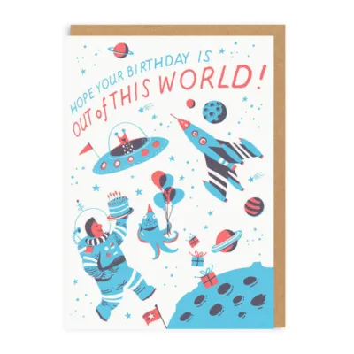
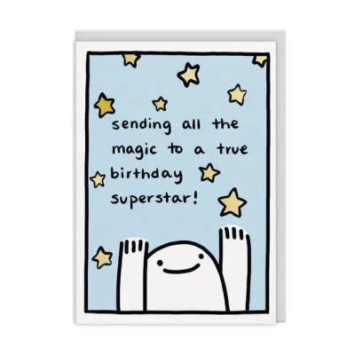
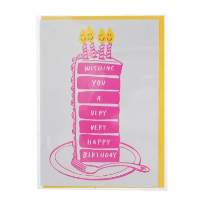
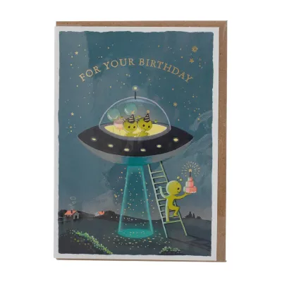
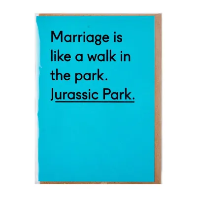
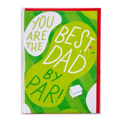
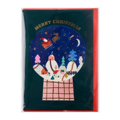
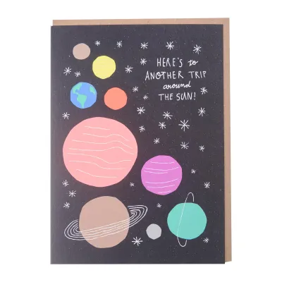
Prices are valid at publication and may change. Please refer to the product page for the latest price.
Always take a moment to review the interior of the card, or deliberately opt for a blank interior. A blank card offers the ultimate flexibility, allowing you to tailor the tone entirely through your handwritten message. If the card does feature a printed inside message, ensure it matches the spirit of the front cover and does not inadvertently clash with the message you plan to write. The harmony between the cover art, the pre-printed text, and your personal words creates a cohesive and thoughtful presentation.
Choosing the Right Ohh Deer Birthday Card by Relationship
Birthdays represent the most frequent occasion for giving cards, but a one-size-fits-all approach rarely works. The ideal birthday card should reflect the history and closeness of your relationship with the recipient. Ohh Deer’s extensive collection allows you to navigate everything from formal family milestones to lighthearted, humorous exchanges with lifelong friends.

Milestone and Sentimental Birthdays
For significant age milestones—such as a 30th, 50th, or 70th birthday—or when writing to older relatives and close mentors, the tone should skew toward warmth, respect, and celebration. Elegant botanical prints, soft watercolor illustrations, and sophisticated metallic-foiled typographic designs are excellent choices here. These designs convey that you recognize the importance of the milestone and have chosen something of high aesthetic value to mark the occasion.
It is wise to avoid sarcastic humor, age-related jokes, or highly niche internet humor when selecting cards for older relatives or formal acquaintances. What might seem like a harmless joke about getting older can sometimes be misinterpreted, detracting from the celebratory spirit of the day. Instead, look for designs that feel timeless and artistic, focusing on beauty and positive wishes.
To elevate the sentimental value of these cards, pair the elegant cover with a detailed, handwritten personal message inside. Use the space to share a specific memory, express gratitude for their presence in your life, or highlight a quality you admire in them. A beautifully designed card combined with a sincere, well-thought-out message often becomes a treasured keepsake that the recipient holds onto for years.
Humorous and Quirky Birthdays for Friends
When celebrating close friends, siblings, or peers who share your specific sense of humor, Ohh Deer’s signature wit truly shines. This is the perfect opportunity to select quirky animal illustrations, clever wordplay, and slightly sarcastic or self-deprecating greetings. These designs work exceptionally well because they mirror the casual, fun-loving dynamic of close personal friendships.
Before finalizing your choice, read the front and inside text carefully to ensure the joke lands exactly as intended. Sarcastic or edgy humor relies heavily on mutual understanding; make sure the punchline does not accidentally touch on a sensitive personal topic or cross an unspoken boundary. The goal is to bring a genuine laugh, not to cause momentary awkwardness on their special day.
Try to match the specific sub-genre of humor to your friend’s unique personality. For a friend who appreciates dry, observational wit, a minimalist typographic card with a sharp, ironic statement is ideal. For someone who loves whimsical or cute things, a colorful illustration of an animal caught in a funny, relatable situation will resonate much better. Tailoring the humor shows how well you truly know them.
Matching Thank-You Cards to the Scale of the Favor
Expressing gratitude is an art that requires matching the visual weight of the card to the magnitude of the favor. A thank-you card for a professional reference should look and feel vastly different from a note thanking a friend for hosting a weekend dinner. Ohh Deer’s range offers paths for both formal appreciation and casual, warm gratitude.
Formal and Professional Appreciation
When thanking a colleague, a client, a teacher, or someone who has provided a significant professional favor, maintaining a respectful and polished tone is essential. Look for minimalist typography, subtle geometric patterns, or classic, subdued floral illustrations. These designs show gratitude clearly and elegantly without crossing into overly familiar or casual territory.
For professional settings, select cards that feature ample blank space inside. This layout allows you to write a clean, structured, and personalized handwritten message that details your appreciation without being crowded by pre-printed text or distracting illustrations. A concise, professional note written on high-quality paper stock speaks volumes about your professionalism.
It is best to avoid overly cute, cartoonish, or humorous illustrations in strict corporate or formal academic environments. While a playful card might seem like a way to break the ice, it can sometimes dilute the perceived sincerity of your professional gratitude. Stick to clean lines, sophisticated color palettes, and premium textures to ensure your message is received with the seriousness it deserves.
Casual and Heartfelt Thanks for Friends and Family
For personal favors, everyday help, or heartfelt appreciation of friends and family, you can afford to be much more expressive and colorful. Choose cards featuring vibrant illustrations, warm color palettes, and friendly, hand-lettered typography. These visual elements immediately convey warmth, joy, and a sense of close connection.
A great tip is to match the card’s visual energy to the specific type of help you received. If a friend spent an entire weekend helping you move house or paint a room, an energetic, bold, and highly colorful design feels appropriate to match the physical effort they put in. If someone hosted you for a cozy home-cooked dinner or listened to you during a tough time, a card with a softer, warm-toned illustration of a quiet scene or a gentle botanical layout fits the mood perfectly.
Your handwritten message inside should focus on how their actions made you feel. Because these relationships are close, you can use informal language, shared jokes, and personal anecdotes. The card serves as a colorful frame for your genuine appreciation, making the recipient feel truly valued for their kindness.
Navigating Apologies: When to Be Sincere vs. Lighthearted
Apologizing is always delicate, and the card you choose can set the tone for the entire conversation that follows. A poorly chosen card can make a sincere apology feel cheap, while an overly dramatic card for a minor mistake can create unnecessary awkwardness. Understanding when to use gravity versus humor is key to a successful apology.
Sincere Apologies for Meaningful Relationships
When you need to make a serious apology for a significant relationship conflict, a major letdown, or a broken promise, sincerity must be your absolute priority. Choose cards with highly subdued colors, gentle botanical illustrations, or very simple, direct typographic designs. The visual presentation should be quiet and respectful, allowing your words to do the heavy lifting.
Under no circumstances should you use humorous, novelty, or heavily illustrated cartoon cards for serious conflicts. Using humor in these situations can easily be misinterpreted as a lack of genuine remorse or an attempt to minimize the issue. It suggests that you are not taking their feelings or the situation seriously, which can deepen the hurt.
In these scenarios, the card should serve primarily as a beautiful, dignified vessel for a deeply considered, handwritten letter of apology. Keep your written message focused on taking full responsibility, acknowledging the impact of your actions, and outlining how you plan to make things right. A clean, quiet card shows that you are approaching the situation with maturity and respect.
Lighthearted Apologies for Minor Mishaps
For low-stakes, everyday slip-ups, a touch of humor can be an excellent way to diffuse minor tension and show that you care. If you forgot a casual coffee meetup, arrived late to a movie, or accidentally finished your roommate’s favorite snacks, a lighthearted card is highly effective. Look for quirky illustrations, self-deprecating puns, or cute animal designs that acknowledge the mistake playfully.
A well-chosen humorous card acts as a gentle icebreaker, making it much easier to transition into a verbal apology and resolve the minor issue. It shows that you recognize the slip-up and want to make amends, but also helps keep the situation in perspective so it does not blow out of proportion.
Keep the written message inside short, sweet, and light. Acknowledge the minor mishap, offer a playful promise to make it up to them—perhaps by buying the next round of coffee or replacing the snacks—and reiterate how much you value their friendship. This approach keeps the relationship warm and resilient over small, daily bumps.
Building a Versatile Card Stash and Presentation Tips
To avoid the stress of last-minute shopping before an event, consider building a small, curated stash of versatile greeting cards at home. Keeping a selection of blank Ohh Deer cards—especially those featuring beautiful botanical prints, abstract patterns, or simple artistic illustrations—ensures you are always prepared. These multi-purpose designs can easily adapt to unexpected birthdays, sudden thank-you notes, or sensitive situations like sympathy needs where finding the right store-bought card quickly can be challenging.
When it comes to writing your cards, the tools you use can significantly impact the final presentation. Ohh Deer cards are printed on high-quality, often textured or coated paper stocks. To prevent smudging and feathering, pair your cards with high-quality writing instruments. Archival gel pens, fine-liners, or quick-drying ballpoint pens work exceptionally well on these surfaces. If you prefer using a fountain pen, perform a quick test on a tiny, inconspicuous corner of the card or envelope first to ensure the ink does not bleed or feather on the specific paper texture.
Before purchasing, it is always a good practice to check the official brand website or authorized online stationery retailers in Singapore. This allows you to verify the current collections, explore specific paper textures (such as textured FSC-certified board), and confirm envelope inclusions. Taking these small steps ensures your physical card matches the premium quality of the message you write inside.
Frequently Asked Questions (FAQ)
Are Ohh Deer cards eco-friendly or made from recycled paper?
Environmental sustainability is a key consideration for many stationery enthusiasts. Because Ohh Deer collaborates with various printing partners, manufacturing processes, and paper mills across different collections, the exact eco-specifications can vary. Many of their collections utilize FSC-certified boards, recycled paper envelopes, or biodegradable packaging. To verify the exact environmental credentials of a specific card, always check the product description on the retailer’s website or inspect the back of the physical card packaging, where eco-labels and material certifications are typically printed.
Do the cards come with envelopes, and what sizes are available?
Yes, standard Ohh Deer greeting cards typically include a matching envelope, often made from recycled kraft paper or colored stock that complements the card’s design. While most cards conform to standard square or rectangular greeting card dimensions (such as A6 or 140mm square), sizes can vary across different artist collections. If you plan to include flat gifts, vouchers, gift cards, or specific photo prints inside the envelope, it is highly recommended to check the exact dimensions listed on the product page before purchasing to ensure a perfect fit.

Community discussion
Share your experience or ask a question. Comments are reviewed before publication.