
Crafting a luxury greeting card at home is an exercise in restraint, precision, and tactile appeal. Instead of relying on mass-produced designs, creating a card that feels like a private, “by invite only” event requires a shift in mindset from decoration to curation. High-end stationery relies on the subtle interplay of weight, texture, and minimalist design rather than flashy embellishments. By mastering a few key techniques—such as precise scoring, digital layout alignment, and controlled wax sealing—you can produce professional-grade greeting cards from your own desk.
Achieving this level of finish requires an understanding of how materials interact under different conditions. For instance, in Singapore’s humid tropical climate, paper selection and ink drying times require special attention to prevent warping and smudging. This guide details the exact steps, tools, and design principles needed to craft exclusive, bespoke greeting cards that command attention the moment they are held.
Designing the 'By Invite Only' Aesthetic: Less is More
The hallmark of an exclusive, high-end invitation is visual quietness. When a card looks uncluttered, it signals that the message inside is highly curated and intended for a select audience. This aesthetic relies heavily on negative space—the empty areas surrounding your text or design. Rather than filling every square centimeter of the card, allow at least 60% to 70% of the surface to remain completely blank. This empty space acts as a visual frame, drawing the recipient’s eye directly to the central message and emphasizing its importance.
Products mentioned in this guide
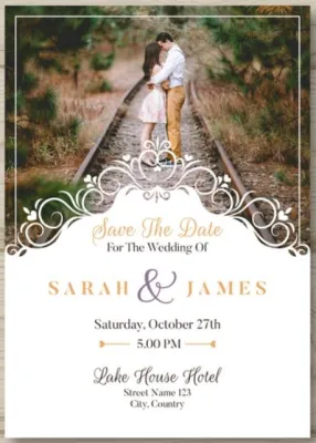
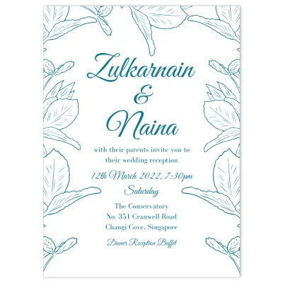
![Cards Prints Printing Custom sizes Wedding Invitations events party service [No MIN Qty]](https://img.lazcdn.com/g/p/2da5b0878ec636a94d5a2590c58bfff1.jpg_400x400q80.jpg_.webp)
Prices are valid at publication and may change. Please refer to the product page for the latest price.
Typography is the next critical pillar of the minimalist aesthetic. To convey a sense of timeless elegance, limit your design to two complementary typefaces. A classic, high-contrast serif font (such as Baskerville or Garamond) pairs beautifully with a clean, modern sans-serif for secondary details. Alternatively, a delicate, hand-drawn script can serve as a focal point, provided it remains highly legible. Avoid trendy, overly distressed, or cartoonish fonts, which immediately detract from the premium feel.
Color palettes should remain similarly restrained. A luxury palette typically consists of neutral tones—such as warm off-white, charcoal, forest green, deep navy, or rich burgundy—complemented by a single, subtle metallic accent. Bright, highly saturated primary colors can easily look juvenile or commercial. By sticking to a muted, sophisticated color family, you evoke the quiet confidence of a private club or an exclusive gallery opening.
Essential Materials and Tools for a Premium Finish
The physical weight and texture of a card are the first things a recipient notices. Standard copy paper or lightweight craft store cardstock will not suffice for an “invite-only” presentation. Instead, opt for heavyweight cardstock with a minimum weight of 300 grams per square meter (gsm). Cotton paper is highly recommended for its soft, pillowy texture and exceptional tactile feedback. Alternatively, linen-textured or deckle-edged papers offer an organic, artisanal quality that feels distinctly premium. Heavyweight cotton paper typically ranges from S$15 to S$30 per pack of 25 sheets at specialty stationery boutiques.

Selecting the right ink and writing tools is equally vital. If you are hand-lettering, use pigment-based archival inks or high-quality pigment liners. These inks sit on top of the paper fibers rather than sinking in and spreading, resulting in crisp, sharp lines. For fountain pens or calligraphy nibs, verify that the ink is formulated to resist feathering on textured paper. In humid environments, dye-based inks can take a remarkably long time to dry and may bleed if the card is handled with damp hands, making waterproof pigment inks the safer choice.
Before printing your designs at home, you must verify your printer’s technical specifications. Most standard desktop printers utilize a curved paper path that feeds from a bottom cassette, wraps around a roller, and exits at the top. This mechanism will jam or damage heavy cardstock. To print on paper thicker than 220 gsm, you generally require a printer with a straight-through manual feed slot or a rear paper tray. Always check the manufacturer’s manual for the maximum supported media weight and thickness (often measured in millimeters) to avoid costly mechanical issues.
To transition from raw materials to a finished product, invest in a set of professional-grade construction tools. A self-healing cutting mat provides a stable, non-slip surface and protects your workspace. A heavy, cork-backed metal ruler is essential for keeping your cuts straight and preventing the ruler from slipping mid-stroke. For cutting, use a sharp craft knife with replaceable carbon steel blades; a dull blade will tear the paper fibers and leave ragged edges. Finally, a bone folder and a dedicated scoring board are non-negotiable for creating clean, professional folds.
Step-by-Step Guide to Assembling Luxury Cards
Designing and Preparing the Layout
Before committing your premium cardstock to the printer or cutting mat, you must establish a precise digital or physical layout. If you are designing digitally using graphic software, set your canvas size to match your unfolded card dimensions. Crucially, incorporate a “bleed” margin of at least 3 mm on all sides if your design elements or background colors extend to the edge of the paper. This ensures that any slight shifting during the cutting process does not leave unsightly white slivers along the borders.
Set your design file’s resolution to a minimum of 300 dots per inch (dpi) and export it as a print-ready PDF. Low-resolution files or compressed image formats like JPEG can result in pixelated text and blurry lines, which instantly ruin the premium illusion. If your printer has a “borderless” setting, enable it, but double-check that the print scale is set to 100% rather than “fit to page,” which can distort your carefully planned margins.
For those opting for hand-lettering, preparation is equally meticulous. Never write directly onto your final cardstock without a plan. Draw light, erasable guidelines using a hard lead pencil (such as a 2H or 4H) and a ruler. Practice your lettering strokes on scrap pieces of the exact same cardstock to gauge how the ink flows and how long it takes to dry. Only when you are confident in your spacing, alignment, and ink consistency should you begin lettering on the final card.
Cutting, Scoring, and Folding
Achieving perfectly straight, crisp edges is what separates amateur crafts from professional-grade stationery. Place your printed or lettered sheet onto the self-healing mat. Align your cork-backed metal ruler with your crop marks. When cutting with a craft knife, hold the knife at a 45-degree angle and pull it toward you with moderate, even pressure. It is far better to make two or three light passes along the ruler than to force the blade through thick cardstock in a single pass, which can cause the blade to slip or the paper to bunch.
Safety First: Always keep your non-cutting hand flat on the ruler, well away from the path of the blade. Never pull the knife directly toward your fingers, and always retract or cap the blade immediately after use.
Once your card is cut to size, you must score it before attempting to fold it. Attempting to fold heavyweight cardstock (above 250 gsm) without scoring will rupture the outer paper fibers, resulting in a jagged, cracked spine. To score, place your card on a scoring board or use a ruler to mark the center line. Run the rounded tip of a bone folder firmly along the line to compress the paper fibers. Fold the card away from the groove (the bump created by the scoring tool should be on the inside of the fold) and use the flat edge of the bone folder to press the crease flat.
Adding Luxe Embellishments
Embellishments should be applied with extreme restraint to maintain the “by invite only” aesthetic. One highly effective technique is metallic edge painting. To do this, stack your folded cards tightly together, clamp them securely between two pieces of scrap wood, and apply a very dry layer of metallic acrylic paint or liquid gilding to the exposed edges using a fine-sponge brush. This creates a stunning, subtle flash of gold or silver when the card is viewed from the side.
Wax sealing is another classic embellishment that adds immediate tactile luxury. To create a clean seal, melt high-quality flexible wax beads in a metal spoon over a small tea light candle. A reliable wax seal kit can be found on online marketplaces for under S$25. Once the wax reaches a warm, honey-like consistency, pour a circle slightly smaller than your stamp onto the card. Let the wax sit for five to ten seconds to cool slightly before pressing the metal stamp firmly into the center. Leave the stamp in place for approximately thirty seconds to allow the wax to solidify completely before gently lifting it away.
Working Safely with Heat: Always perform wax melting in a well-ventilated room on a heat-resistant surface, such as a silicone mat or ceramic tile. Keep loose hair and clothing secured, and never leave an open candle flame or hot melting spoon unattended. If you are producing cards in bulk, place your metal stamp on an ice pack between presses; a cold stamp releases from the warm wax much more cleanly and prevents the wax from sticking to the metal engraving.
Perfecting the Presentation: Envelopes and Sealing
The unboxing experience is an integral part of the luxury presentation. An exquisite card paired with a flimsy, standard envelope immediately breaks the illusion of exclusivity. Select envelopes made from heavyweight paper (at least 120 gsm) that match or complement the color tone of your card. The envelope should fit the card snugly; there should be no more than 3 mm to 5 mm of wiggle room on any side to prevent the card from shifting excessively in transit.
To elevate the presentation further, construct custom envelope liners. Choose a lightweight paper—such as a delicate vellum, a subtle geometric pattern, or a solid contrasting color—and cut it to fit just below the envelope’s adhesive line. Use a dry adhesive runner or double-sided tape to secure the liner inside the envelope flap. This simple addition adds a delightful pop of color and weight when the recipient opens the envelope.
Addressing the envelope should be treated with the same care as the card itself. If your hand-calligraphy skills are still developing, you can print addresses directly onto the envelopes using your home printer, provided it can feed envelopes without creasing them. Alternatively, print your addresses on high-quality matte labels, cut them with your craft knife, and apply them precisely.
To complete the outer presentation, consider your sealing method. A wax seal on the exterior of the envelope is beautiful but can sometimes be damaged or caught in automatic postal sorting machines. If you are mailing the card through the standard postal service, place the wax seal on the card itself or on an inner vellum wrap, and use a strong, moisture-activated adhesive or a custom return address stamp to secure the outer envelope. For hand-delivered invitations, an exterior wax seal remains the gold standard of luxury presentation.
Common Crafting Mistakes and How to Avoid Them
Even experienced crafters can encounter issues that compromise the high-end look of their stationery. Understanding these pitfalls allows you to take preventative measures before starting your production run.
- Ink Smudging: This is particularly common on heavily textured or coated papers, where ink takes longer to dry. In Singapore's humid climate, drying times can double. Always test your ink and paper combination on a scrap piece first. If the ink remains wet after several minutes, use a heat gun on its lowest setting to set the ink, or switch to a fast-drying pigment ink.
- Cracked Folds: If you notice the spine of your card looks rough or cracked, you likely folded it in the wrong direction or did not apply enough pressure during the scoring process. Remember to score on the side that will face outward, and fold the paper inward, compressing the groove.
- Over-embellishing: It is easy to get carried away with gold leaf, ribbons, and wax seals all on one card. If a card begins to look busy, strip away one element. A single, perfectly executed wax seal on a blank background carries far more luxury weight than a card crowded with multiple metallic finishes.
Before sealing your cards and sending them off, perform a final inspection check. Use a clean, dry cloth to gently wipe away any stray paper dust or pencil guidelines. Check the edges for any tiny paper burrs left by a dull blade, and trim them carefully. Finally, ensure that any adhesive used is completely dry and has not seeped onto other parts of the card, guaranteeing a flawless, professional presentation.

Community discussion
Share your experience or ask a question. Comments are reviewed before publication.