
Choosing your first watercolor paint set can feel overwhelming with hundreds of options filling art supply shelves. For a beginner, the ideal watercolor paint set balances affordability with reliable pigment performance, typically offering 12 to 18 student-grade colors in a format that fits your dedicated creative space. Investing in a set with pure, easily reactivated pigments—rather than cheap, filler-heavy alternatives—ensures you spend your time learning water control and color theory instead of fighting muddy, chalky washes.
By focusing on paint grade, format, color selection, and clear label specifications, you can confidently select a starter set that supports your artistic growth. This guide breaks down these critical decision dimensions so you can find a high-performing, cost-effective set and verify its quality through simple home testing.
Why the Right Watercolor Set Accelerates Your Learning
Many aspiring artists abandon watercolor painting out of frustration, believing their technique is at fault when the true culprit is poor-quality paint. Low-cost, “toy-grade” watercolor sets are packed with cheap binders and synthetic dyes rather than actual mineral pigments. These paints resist reactivation when wet, refuse to blend smoothly, and dry to a dull, chalky finish that bears little resemblance to the vibrant washes characteristic of the medium.
Products mentioned in this guide
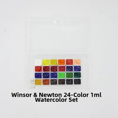
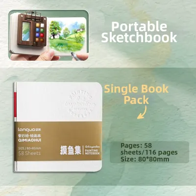
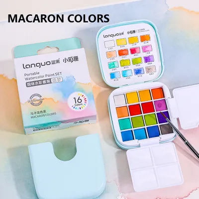
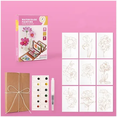
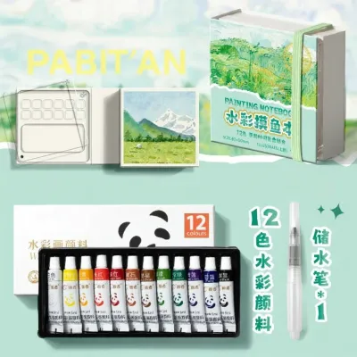
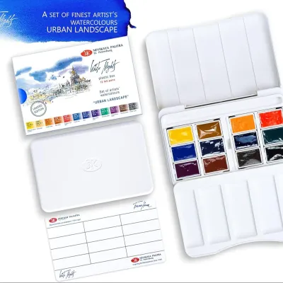
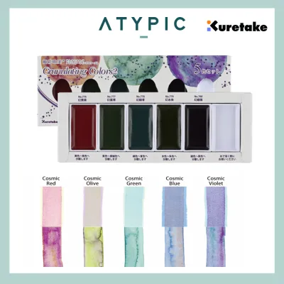
Prices are valid at publication and may change. Please refer to the product page for the latest price.
Your primary goal when starting out is to find a paint set that behaves predictably. Watercolor is a unique medium that relies on the fluid interaction of pigment, water, and paper. When your paint reacts consistently to varying amounts of water, you can master essential techniques like flat washes, gradients, and soft glazing. A quality starter set builds visual confidence by showing you exactly how pigments flow and mix.
To make an informed purchase, you must evaluate four core dimensions: the paint grade, the physical format (pans versus tubes), the color count, and the technical specifications printed on the packaging. Prioritizing these features prevents you from wasting money on frustrating materials that hinder your progress.
Understanding Paint Grades: Why Student-Grade is the Best Starting Point
Art manufacturers generally divide their products into two main categories: student-grade and professional-grade. Student-grade watercolors are formulated specifically for learning. They utilize a higher ratio of binders and fillers relative to raw pigment, which significantly lowers production costs while maintaining a highly consistent, predictable performance across different colors in the set.

In contrast, professional-grade watercolors contain the maximum possible pigment concentration with minimal fillers. While this results in breathtaking vibrancy and unique handling characteristics, professional paints are expensive and often behave unpredictably. Certain natural pigments granulate heavily, stain the paper instantly, or dry at widely different speeds. These complex behaviors can easily overwhelm a beginner who is still trying to master basic water control.
For those starting out, student-grade paints offer a forgiving learning curve and excellent value for money. They allow you to practice washes and color mixing extensively without worrying about the cost of every brushstroke. Modern student-grade lines from reputable heritage brands deliver surprising clarity and mixing capabilities that closely mimic their professional counterparts.
However, you should actively avoid unbranded “craft” watercolors or generic multi-media paint kits. These products often lack lightfastness, meaning your paintings will fade within weeks when exposed to light, and they rarely list their ingredients or pigment codes. You can identify these low-grade sets by their lack of brand transparency, unusually low prices, and generic labels that omit technical pigment information.
Pan vs. Tube Watercolors: Choosing the Right Format for Your Workspace
Watercolor paint is sold in two primary physical formats: solid dry cakes called pans, and moist paste packaged in squeezable metal or plastic tubes. Neither format is objectively superior to the other; instead, your choice should depend on where you plan to paint, the scale of your artwork, and how you prefer to organize your creative workspace.
Pan Watercolors (Solid Cakes)
Pan watercolors are small, dry blocks of paint nested into plastic cups within a carrying tin. To use them, you simply activate the dry surface with a wet brush. This format is highly favored for its exceptional portability and ease of cleanup, making it the perfect choice for small-scale sketching, art journaling, and outdoor painting (plein air).
If you have limited desk space at home, a compact pan set is incredibly convenient because it requires minimal setup and can be packed away in seconds. The primary limitation of pans is the effort required to lift large quantities of highly concentrated paint. If you plan to paint large, sweeping washes across expansive sheets of paper, repeatedly scrubbing a small dry pan to gather enough pigment can damage your brushes and tire your hand.
Tube Watercolors (Liquid Paste)
Tube watercolors contain moist, concentrated paint that you squeeze directly onto a mixing palette. Because the paint is already wet, it dissolves instantly in water, allowing you to quickly mix large volumes of rich, vibrant color for expansive washes and bold, expressive techniques on larger paper sizes.
Tubes offer maximum control over paint consistency, but they require a dedicated mixing surface and carry a higher risk of paint waste if you squeeze out more than you need. In highly humid environments, such as Singapore’s tropical climate, squeezed tube paint left on an open palette may remain slightly tacky rather than drying bone-dry. This makes mold prevention a priority; always allow your palette to dry completely in a well-ventilated space before closing and storing it in a drawer.
How Many Colors Do You Really Need? The Case for a Limited Palette
It is tempting to buy the largest paint set available, but massive sets containing 48 or more colors are often a counterproductive trap for beginners. A vast array of pre-mixed colors can easily overwhelm your decision-making process and lead to “muddy” paintings. When you do not understand how those pre-mixed shades interact, combining them randomly on the paper often results in dull, greyish-brown mixtures.
Instead, look for a focused starter set containing 12 to 18 colors. A well-curated limited palette typically features a “split-primary” system, which includes both a warm and a cool version of each primary color (red, yellow, and blue), alongside a few essential earth tones like Yellow Ochre and Burnt Sienna. This structured selection forces you to learn the fundamentals of color mixing.
By practicing with a limited palette, you will quickly discover how to mix your own vibrant secondary greens, oranges, and purples. This process builds a deep, intuitive understanding of color theory that you would completely miss if you relied solely on pre-mixed convenience colors. Additionally, a limited color range naturally creates a more harmonious and cohesive look across your finished paintings.
Decoding Paint Labels: Transparency, Lightfastness, and Pigment Quality
To evaluate the quality of a watercolor set objectively, you must look past the marketing text on the front of the box and examine the technical specifications printed on the individual tubes, pans, or the manufacturer’s color chart.
Transparency and Opacity Traditional watercolor relies on light passing through the paint layer, reflecting off the white paper underneath, and passing back to your eye. This gives the medium its signature luminous quality. Look for transparency symbols on the packaging: an empty circle or square usually denotes a fully transparent paint, a half-filled shape indicates semi-transparent, and a solid black shape indicates an opaque paint. Beginners should prioritize transparent paints, as they are much easier to layer (glaze) without creating a chalky, heavy buildup.
Lightfastness Ratings Lightfastness refers to a pigment’s ability to resist fading or changing color when exposed to light over time. Reliable manufacturers rate their paints using the standardized ASTM International scale (where Category I is Excellent and Category II is Very Good) or a star system (where three or four stars typically denote high archival permanence). If you want your practice pieces and finished paintings to retain their original colors for years to help build your portfolio, ensure the set features high lightfastness ratings.
Pigment Codes vs. Convenience Mixes Every legitimate artist paint lists its Pigment Color Index Name, which consists of letters and numbers (for example, PB29 stands for Pigment Blue 29, which is Ultramarine Blue). A single-pigment paint contains only one pigment code, making it clean and predictable when mixed. A “convenience mix” combines multiple pigments to create a specific shade, often labeled with the word “Hue” (such as “Cobalt Blue Hue”). While convenience mixes are useful for quick painting, using too many of them in a mix can quickly result in muddy tones, so look for a starter set that features a high proportion of single-pigment colors.
Evaluating Included Accessories: What Matters and What to Ignore
Many beginner watercolor sets are packaged with bundled accessories like brushes, mixing palettes, water brushes, or sponges. While these extras can make a set feel like a complete package, they are often low-quality additions designed to inflate the retail price. You must evaluate these accessories critically to determine if they offer genuine utility.
- The Palette: A good built-in palette should feature deep, distinct mixing wells to prevent colors from running into one another. It must have a secure, leak-resistant lid if you plan to travel, and the mixing surface should be white or neutral grey. A white surface is essential for judging the true value and tone of your paint mixtures before applying them to your paper.
- The Brushes: Bundled brushes are frequently made of stiff, low-grade synthetic bristles that shed hairs and fail to hold their shape. A proper watercolor brush must have soft, absorbent bristles that can hold a generous amount of water and spring back to a fine, sharp point when wet. If the included brush feels stiff or scratchy, plan to purchase a standalone round synthetic-sable brush (size 6 or 8 is highly versatile) to accompany your set.
- The Extras: Items like refillable water brushes (brushes with a water reservoir in the handle), natural sponges, or small jars of masking fluid are convenient additions for travel or specific techniques, but they should never influence your purchase. Always prioritize the chemical quality of the paint itself over the quantity of plastic accessories packed into the box.
Step-by-Step: How to Test and Swatch Your New Watercolor Set
Once you unbox your new watercolor paint set, the first step is to test and swatch the colors. This process introduces you to the unique handling characteristics of each pigment and verifies that the paint performs as advertised.
Before you begin, ensure you are testing on dedicated watercolor paper. Always use paper with a minimum weight of 300 gsm (140 lb), preferably cold-pressed. Standard printer paper or general sketching paper will instantly buckle, pill, and tear under water washes, making it impossible to evaluate how the paint actually flows and absorbs.
Follow these four diagnostic steps to test your paint set:
Step 1: The Rewetting Test
If you are using a pan set, place a single drop of water onto each dry cake and let it sit for 30 seconds. Gently sweep a damp brush across the surface. High-quality paint should reactivate instantly, releasing a rich, highly saturated pool of color with minimal physical scrubbing. If you have to press hard or scrub repeatedly to lift any pigment, the paint contains excessive binders and will be difficult to work with.
Step 2: Flow and Granulation Test
Wet a clean square on your watercolor paper with plain water until it has a uniform, satin sheen. Load your brush with concentrated paint and gently touch the tip to the wet paper. Observe how the pigment spreads (disperses) through the water. Quality watercolor should bloom outward smoothly. As the swatch dries, look closely at the texture: some pigments will settle naturally into the valleys of the paper texture, a beautiful, textured effect known as granulation.
Step 3: Transparency Test
Using a black permanent waterproof marker, draw a thick, solid line across your watercolor paper and let it dry completely. Paint a thick, continuous stroke of your watercolor directly over the black line, transitioning from a highly concentrated mix to a watery wash. Once dry, examine the intersection. A truly transparent paint will leave the black line perfectly dark and visible, whereas an opaque or filler-heavy paint will leave a cloudy, chalky residue over the black marker.
Step 4: Lifting Test
Paint a solid, saturated swatch of color on your paper. While the paint is still wet, press a clean, dry paper towel or sponge firmly onto a portion of the swatch to see how easily the pigment lifts off the paper. Once the remaining paint has dried completely, take a damp, stiff brush and gently scrub a small area, then blot it with a tissue. This test shows you whether a pigment is “staining” (sinking deep into the paper fibers) or “non-staining” (sitting on the surface, allowing you to easily correct mistakes or create highlights later).
Frequently Asked Questions (FAQ)
Can I use student-grade watercolors for professional artwork?
Yes, student-grade watercolors are excellent for practice, color studies, and sketchbook work. However, they are generally not recommended for final commissioned or gallery pieces. Their lower pigment concentration makes it difficult to achieve intense, deep values, and they may contain pigments with lower archival permanence, meaning the artwork could fade or shift color over decades of exposure to light.
Do I need to buy extra watercolor paper with my paint set?
Yes, purchasing dedicated watercolor paper is absolutely essential. Standard printer paper, cardstock, or generic sketchbooks cannot handle the water volume required for watercolor painting; they will buckle, warp, pill, and cause the paint to pool unevenly. For the best results, invest in cold-pressed watercolor paper with a standard weight of 300 gsm (140 lb), which is specifically designed to absorb water evenly and preserve the vibrant characteristics of your paint.
Community discussion
Share your experience or ask a question. Comments are reviewed before publication.