
Selecting the perfect greeting card is an art of matching visual aesthetics with emotional intent. Colour Lomo greeting cards, known for their distinct photographic style, saturated hues, and nostalgic borders, offer a versatile canvas for various life events. Finding the right card involves aligning the visual tone of the design with the specific relationship and occasion, ensuring your message resonates deeply with the recipient.
By understanding how design elements influence perception, you can confidently choose a card that feels personal and intentional. Whether you are celebrating a major milestone, sending seasonal wishes, or offering quiet comfort, the right combination of imagery and paper quality will elevate your handwritten words.
Decoding Design Themes and Visual Tones
Every greeting card communicates a message before it is even opened. The color palette of a design plays a significant role in setting this initial emotional tone. Vibrant, highly saturated colors evoke energy, excitement, and joy, making them excellent choices for festive celebrations. Conversely, muted, pastel, or sepia-toned palettes suggest nostalgia, warmth, and quiet reflection, which are better suited for intimate milestones or sensitive messages.
Products mentioned in this guide
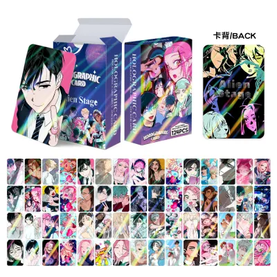
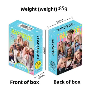
Prices are valid at publication and may change. Please refer to the product page for the latest price.
Illustration and photographic styles also dictate how formal or casual a card feels. Minimalist layouts with clean borders and ample white space offer a modern, sophisticated aesthetic that works well for professional contacts or acquaintances. Highly detailed, abstract, or candid photographic compositions invite closer inspection and are ideal for close friends who appreciate artistic depth and unique visual storytelling.
Typography and layout balance the overall design to ensure readability and aesthetic harmony. Bold, sans-serif fonts convey a casual, contemporary vibe, whereas elegant script or classic serif typography lends a sense of formality and tradition. When selecting a card, observe how the text interacts with the imagery; a well-balanced layout ensures the design feels cohesive rather than cluttered.
Selecting Cards for Personal Milestones and Celebrations
Personal milestones represent key chapters in a person’s life, and the cards we choose should reflect the significance of these moments. For birthdays, the challenge lies in balancing fun, age-appropriate themes with adequate space for personalized messages. For children or close friends, look for playful imagery and bright color contrasts. Ensure the interior or reverse side provides a clean, unblemished writing surface so your personal anecdotes are easy to read.

Weddings and anniversaries demand a shift toward elegant, timeless designs and premium paper textures. Look for cards featuring soft floral photography, classic architecture, or minimalist landscapes that mirror the gravity of a lifelong commitment. The tactile feel of the card stock is crucial here; a heavier weight card feels more substantial and serves as a lasting keepsake for the couple.
Graduations and career transitions benefit from motivational and forward-looking visual elements. Images of open roads, expansive skies, or abstract geometric patterns pointing upward convey a sense of progress and encouragement. These designs should inspire confidence and pride, providing a uplifting backdrop for your advice and well-wishes for their next chapter.
Navigating Holiday and Seasonal Greetings
Holiday cards connect us with a broader circle of friends, family, and colleagues during shared, calendar-based celebrations. For major cultural festivals, look for designs that align traditional motifs with modern design aesthetics. A contemporary photographic interpretation of classic holiday symbols respects cultural traditions while appealing to modern design sensibilities, making the card suitable for a diverse range of recipients.
Seasonal transitions offer an excellent opportunity to use color psychology to match the time of year. Warm, golden tones and rich earth colors naturally evoke autumn and year-end cozy feelings, perfect for November and December greetings. Bright, airy, and pastel-heavy designs mirror the freshness of spring and summer, making them excellent choices for mid-year celebrations and warm-weather gatherings.
When sending holiday greetings, it is important to distinguish between corporate and personal relationships. For colleagues, clients, or business partners, opt for neutral themes such as architectural details, winter landscapes, or simple geometric patterns. Save highly personal, humorous, or deeply emotional photographic styles for family members and close friends who share those specific memories.
Setting the Right Tone for Gratitude and Sympathy
Expressing gratitude or offering condolences requires a high degree of sensitivity, where the design of the card must respect the depth of the situation. For thank you notes, match the visual weight and design complexity to the magnitude of the favor or gift received. A simple, clean design with a single focal point works best for everyday appreciation, while a more elaborate visual composition reflects deep gratitude for major life support.
Sympathy and get-well cards require calming colors, subtle patterns, and respectful, understated typography. Soft blues, gentle greens, and warm neutrals help convey comfort and peace. Avoid high-contrast imagery, neon colors, or busy layouts that might feel jarring or insensitive to someone going through a difficult or painful time.
Identifying and avoiding overly festive, loud, or humorous designs in sensitive contexts is essential. A card featuring bright party motifs or playful text can inadvertently diminish the sincerity of your condolences. When in doubt, select a quiet, abstract landscape or a simple, unadorned card that allows your handwritten words to carry the emotional weight of your support.
Essential Stationery Checks Before Purchasing
Before finalizing your purchase, verifying the physical specifications of the card ensures a smooth writing and mailing experience. Pay close attention to dimensions and envelope compatibility. Standard rectangular cards fit easily into standard postal envelopes, but square or oversized cards often require specialized envelopes and may incur additional postage fees at local post offices.
Paper weight, grain, and texture directly affect how your writing instruments perform. High-quality greeting cards typically use card stock ranging from 250 to 350 gsm, which prevents the card from bowing when displayed on a shelf. The texture—whether matte, glossy, or uncoated—determines ink compatibility. Smoothness, bleed resistance, drying speed, and water resistance depend on the exact combination of paper and ink, so it is always wise to perform a quick scribble test on a scrap piece of paper first.
Evaluate the interior layout to ensure it matches your writing style. Choose between completely blank interiors, which offer maximum flexibility for long-form letters, and cards with subtle pre-printed prompts. Ensure the writing area is free from heavy ink coatings, as glossy interiors can cause gel pens and fountain pens to smear, feather, or fail to dry properly.
Frequently Asked Questions (FAQ)
Can I use the same card design for both casual and formal occasions?
Yes, many versatile designs can transition between casual and formal contexts depending on how you present them. A minimalist landscape or abstract geometric card can be elevated for a formal event by pairing it with a high-quality, textured envelope and writing with a classic fountain pen. For a casual setting, the same card can be paired with a colorful envelope and a playful, handwritten message using a gel pen. The key is to let your written tone and presentation accessories bridge the gap between different levels of formality.
How do I ensure my handwriting looks good on the card's interior?
Achieving clean, legible handwriting depends heavily on matching your writing instrument to the card’s paper finish. For uncoated or matte paper, water-based gel pens, fine liners, and fountain pens work beautifully, offering smooth ink flow and quick drying times. If the card interior has a semi-gloss or satin finish, opt for a high-quality ballpoint pen or a permanent pigment liner to prevent smudging and feathering. Always allow the ink to dry completely for a few minutes before folding the card or placing it inside the envelope.
Community discussion
Share your experience or ask a question. Comments are reviewed before publication.