
Choosing the right blank white card for DIY crafting requires matching the paper’s weight, texture, and finish to your specific creative technique. A card that is ideal for crisp ink stamping may warp instantly under watercolor washes, while a heavy cardstock suitable for structural greeting cards might jam a standard home printer. By understanding how paper specifications interact with inks, adhesives, and cutting tools, you can confidently select the right medium for your project, ensuring professional results and preventing wasted materials.
Understanding Paper Weight and Thickness for Crafting
Paper weight directly dictates how a blank white card behaves under physical stress, how it folds, and whether it can stand upright on a mantelpiece. In the stationery world, weight is typically measured in grams per square meter (gsm). Instead of relying on a subjective touch test at a local craft store, always check the packaging label for the exact gsm rating. This objective measurement ensures consistency across different batches and brands, allowing you to replicate successful projects without guesswork.
Lightweight cards, generally ranging from 160 gsm to 220 gsm, offer excellent flexibility and are highly compatible with standard home printers. They are easy to fold cleanly by hand and work well for delicate layering or intricate origami elements. However, their lower density makes them highly susceptible to warping, buckling, or bleeding when exposed to wet media like watercolors, heavy calligraphy inks, or liquid craft glues.
Products mentioned in this guide
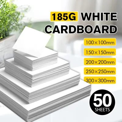
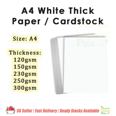
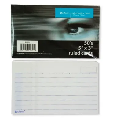
Prices are valid at publication and may change. Please refer to the product page for the latest price.
Heavyweight cards, typically 250 gsm to 300 gsm and above, provide the premium, rigid feel expected of high-quality greeting cards and structural paper crafts. These cards easily support heavy embellishments, multiple paper layers, and light wet media without losing their shape. The trade-off is that heavyweight cardstock is highly prone to cracking along the fold lines if folded directly. To achieve a clean, professional crease, you must use a scoring tool and a bone folder to compress the paper fibers before making the fold.
Matching Paper Texture and Finish to Your Technique
The surface texture and finish of a white card determine how ink adheres, how smoothly your tools glide, and the overall tactile experience of the finished piece. Finishes generally fall along a spectrum from ultra-smooth to highly textured, and from uncoated to coated. Selecting the wrong combination can lead to smudged designs, clogged pen nibs, or adhesives that fail to bond.

Smooth finishes, such as satin, matte, or hot-press surfaces, are a highly effective option for projects requiring high precision. They allow fine-liner pens, calligraphy nibs, and alcohol markers to glide effortlessly without catching or fraying. The lack of surface tooth ensures that stamped images transfer with crisp, sharp edges. On the other hand, textured finishes, such as cold-press or linen textures, excel at grabbing dry media like colored pencils, pastels, and charcoal. The physical valleys in the paper catch the pigment, creating depth and visual interest that smooth paper cannot replicate.
The choice between coated and uncoated surfaces also fundamentally alters how liquids behave on the card. Coated cards have a microscopic sealant layer that keeps ink sitting on top of the paper, resulting in vibrant colors but significantly longer drying times and a higher risk of smudging. Uncoated cards absorb ink directly into the fibers, which speeds up drying but can lead to slight color muting or feathering. Furthermore, many liquid glues struggle to bond securely with highly coated or glossy surfaces, making uncoated options preferable for complex, multi-layered adhesive assemblies. Always verify the finish compatibility with your specific inks or paints by checking the manufacturer’s technical specifications on the packaging.
Selecting the Right White Card for Specific DIY Projects
Every crafting technique subjects paper to a unique combination of physical stress and chemical interaction. Stamping applies downward pressure, watercolor introduces moisture, and digital printing subjects the card to high heat and tight rollers. To ensure your project succeeds, you must align the card’s physical properties with the specific demands of your chosen method.
Stamping, Embossing, and Die-Cutting
For stamping, heat embossing, and die-cutting, structural integrity and surface uniformity are paramount. When selecting a white card for intricate die-cutting, look for options with dense, tightly woven fibers. Low-quality cardstock with loose fibers tends to tear, fray, or leave fuzzy edges when passed through a manual or digital die-cutting machine, ruining delicate lace patterns or fine lettering.
For clear stamping and heat embossing, a smooth, uncoated cardstock is highly recommended. The flat surface allows the photopolymer or rubber stamp to make complete, uniform contact, ensuring a crisp transfer of ink without patchy spots. When heat embossing, an uncoated surface allows the slow-drying embossing ink to sit cleanly without spreading, ensuring that the embossing powder adheres only to the stamped design. This prevents stray powder from sticking to the surrounding card when heated with a hot air tool.
Watercolor, Painting, and Mixed Media
Wet media techniques demand cards that can handle significant moisture without dissolving or warping. Standard white cardstock, even in heavier weights, lacks the internal sizing—a starch or gelatin treatment—needed to control water absorption. Without this sizing, water quickly penetrates the paper fibers, causing the card to buckle, pill, and tear under the friction of a paintbrush.
For watercolor, gouache, and mixed-media projects, choose a dedicated watercolor cardstock, ideally rated at 300 gsm or higher. These cards are specifically engineered to absorb water slowly and evenly, allowing you to blend colors smoothly without structural failure. If you plan to use heavy acrylic paints or multi-layered mixed media involving wet glues and pastes, a heavy mixed-media card with a textured surface will provide the necessary grip and rigidity to support the weight of the medium.
Digital Printing and Calligraphy
Digital printing and hand calligraphy require careful consideration of paper thickness and surface friction to protect both your equipment and your tools. Before attempting to print your designs on heavy cardstock, always verify your home printer’s maximum paper weight capacity in the user manual. Feeding a card that exceeds the printer’s limit can cause frequent paper jams, feed roller wear, or permanent damage to the internal mechanism.
For hand calligraphy, brush lettering, and fine-line illustration, the smoothness of the white card is critical. Look for ultra-smooth, high-density cardstock to protect your delicate brush tips and metal calligraphy nibs. Rough or textured papers act like sandpaper, quickly fraying nylon brush tips and catching on flexible metal nibs, which causes unsightly ink splatters. A smooth surface also prevents ink feathering, ensuring your hand-drawn lines remain sharp and clean.
How to Test and Verify Your White Card Before Crafting
Before committing your time and expensive crafting materials to a final project, establishing a quick testing routine can save you from frustrating mistakes. Even high-quality white cards can behave unexpectedly when paired with specific inks, glues, or tools.
Begin by performing a fold test on a small scrap piece of your cardstock. Fold the paper both along and against the grain to check for edge cracking. If the fold line appears rough, jagged, or split, this is a clear indicator that you must use a scoring board and a bone folder to compress the fibers before making any structural folds.
Next, conduct a media test on a scrap piece from the exact same card batch. Apply your chosen inks, markers, or paints, and observe how they interact with the surface. Note the drying time to determine how long you must wait before handling the card to avoid smudging. Check the back of the scrap card to ensure the ink does not bleed through to the other side, which is especially important for double-sided greeting cards.
Finally, if you are using a digital printer, run a single test sheet of the cardstock before attempting a bulk print run. This allows you to verify that the printer’s feed rollers can grip the paper smoothly without slipping, and that the ink or toner adheres properly without smearing as it exits the machine.
Frequently Asked Questions (FAQ)
Can I use standard printer paper for DIY greeting cards?
Standard printer paper, typically weighing around 80 gsm, lacks the structural rigidity required to stand upright, making it unsuitable for standalone greeting cards. It also warps and bleeds easily when exposed to markers, stamps, or glues. However, you can use standard printer paper for lightweight card inserts, simple origami embellishments, or for sketching out your designs before transferring them to heavier cardstock.
How do I prevent white cards from warping when using glue?
To minimize warping, avoid liquid craft glues, which introduce excessive moisture to the paper fibers. Instead, opt for dry adhesives such as double-sided tape, glue runners, or adhesive sheets. If you must use liquid glue, apply it sparingly with a brush to ensure a thin, even layer. Immediately after assembly, place the card between two sheets of clean scrap paper and press it under a heavy, flat object like a large book while the adhesive sets.
What is the difference between bright white and natural white cards?
Bright white cards are chemically treated or bleached to reflect maximum light, offering a cool, high-contrast background that makes printed colors and dark inks pop with modern intensity. Natural white cards, sometimes labeled as off-white or cream, do not undergo heavy bleaching, resulting in a softer, warmer tone. Natural white is often preferred for vintage, elegant, or rustic designs, as it is gentler on the eyes and blends harmoniously with warm-toned color palettes.
Community discussion
Share your experience or ask a question. Comments are reviewed before publication.