
Choosing the right appreciation card requires balancing personal gratitude with professional boundaries. A well-selected physical card serves as the anchor of any appreciation gift, establishing a sense of respect and thoughtfulness before the recipient even reads your handwritten message. The physical attributes of the card—such as its paper weight, texture, and visual design—form the critical first impression of your gratitude. Because professional, academic, and mentorship relationships each carry distinct social expectations, the ideal card design and tone will vary significantly depending on who is receiving it. By aligning your choice of stationery with the specific nature of your relationship, you ensure your gesture is both meaningful and appropriate.
Understanding the Role of an Appreciation Card in Your Gift
An appreciation card is far more than a simple accompaniment to a physical present; it is the core element that gives the gift its context and emotional value. While a standalone gift can sometimes feel transactional or generic, a high-quality, handwritten card personalizes the gesture, transforming it into a lasting token of mutual respect. The physical characteristics of the card speak volumes before the envelope is even opened. Sturdy cardstock, a refined print finish, and a clean layout immediately signal that you have invested time and care into the presentation. Conversely, a flimsy or poorly printed card can detract from the impact of an expensive gift.
In professional and educational settings, where boundaries must be maintained, a well-chosen card strikes the perfect balance between personal warmth and professional decorum. It provides a dedicated space to articulate your specific gratitude, ensuring your appreciation gift leaves a memorable and highly positive impression.
Products mentioned in this guide
![[MIN 3 CARDS] 🇸🇬SG Punny Teacher Appreciation Card Special Editions for Graduation Greeting Thank You Heartfelt Support Message Card](https://img.lazcdn.com/g/ff/kf/S46b8562713de4564b8cea4c9945a655fF.jpg_400x400q80.jpg_.webp)
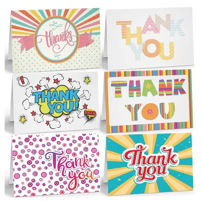
![[SG Seller] Cute Floral Aesthetic Thank You Cards Small Business Packaging Customer Appreciation Inserts Teachers](https://img.lazcdn.com/g/p/8c93e2fa1ebda49573d5c6607d86632e.jpg_400x400q80.jpg_.webp)
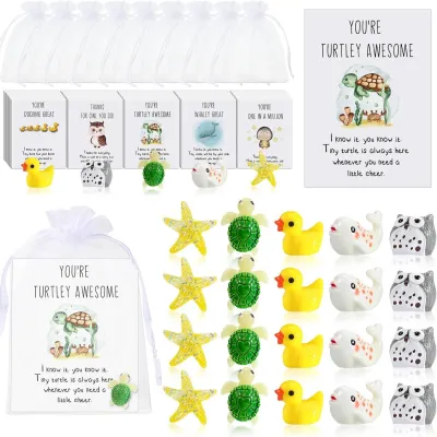
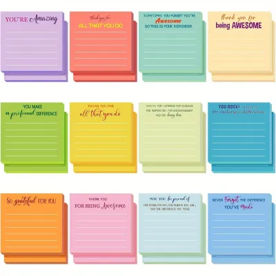
Prices are valid at publication and may change. Please refer to the product page for the latest price.
Matching Card Styles to Professional Relationships
To ensure your card is received with the same sincerity with which it was written, you must match the card’s visual aesthetic and tone to the specific nature of your relationship. Different professional and academic dynamics require distinct approaches to design, size, and messaging. A card that is perfect for a close desk colleague could feel entirely inappropriate for a university professor or a senior industry mentor. Understanding these nuances allows you to select stationery that honors the relationship while respecting established social and professional boundaries.

Colleagues and Team Members
Peer-to-peer relationships in the workplace are built on daily collaboration, shared challenges, and mutual support. When selecting an appreciation card for a colleague or team member, look for approachable, contemporary, or subtly humorous designs. Modern geometric patterns, bright but professional color palettes, and clean, minimalist typography work exceptionally well to foster team camaraderie without crossing professional lines.
Standard, highly practical sizes like A6 (approximately 105 x 148 mm) or standard 5×7 inches are excellent choices. These dimensions are compact enough to sit neatly on an office desk, partition shelf, or computer stand, allowing the recipient to display the card easily without cluttering their workspace. The tone of the card and your message should remain warm, collaborative, and professional. While it is wonderful to reference shared project milestones, late-night deadlines met together, or daily help, avoid overly intimate language or highly specific inside jokes that could be misconstrued if the card is displayed publicly in a shared office environment.
Teachers and Professors
Academic relationships are rooted in respect, guidance, and intellectual development. When choosing a card for a teacher, lecturer, or professor, the visual design should reflect this respectful boundary. Classic, elegant designs, minimalist botanical illustrations, or subtle academic motifs are highly appropriate. Avoid overly loud, cartoonish, or casual patterns unless the card is coming from a very young student.
Teachers and academic mentors frequently treasure notes that detail how their instruction specifically influenced a student’s learning or career path. Therefore, prioritize cards that offer ample blank space inside. A completely blank interior allows you to write a detailed, multi-paragraph handwritten note detailing their patience, dedication, and the specific impact of their educational guidance. The tone should remain polite, respectful, and deeply appreciative of their academic stewardship. Acknowledge the time they invested in your growth, ensuring the message reflects the traditional respect associated with educational mentorship.
Mentors and Coaches
Mentorship represents a deep, highly personalized professional relationship centered on long-term career guidance, wisdom, and personal development. To honor the significant investment of a mentor’s or coach’s time and expertise, opt for premium stationery options. Heavyweight cardstock, traditional letterpress printing, or understated foil-stamped details immediately convey the gravity of your gratitude.
The design should be sophisticated and minimalist, utilizing deep, rich colors or high-quality textured papers that speak to maturity and profound respect. Because a mentor often helps navigate critical career transitions, personal challenges, or strategic decisions, the message inside should be highly reflective and deeply personalized. The physical card must match this depth; a standard, mass-produced card may feel inadequate for someone who has actively shaped your professional trajectory. Selecting a premium card shows that you recognize and respect the high value of the guidance they have generously shared, making it a fitting accompaniment to any appreciation gift.
Key Stationery Features to Evaluate
Evaluating the physical construction of stationery ensures that your writing experience is flawless and that the card maintains its pristine appearance over time. High-quality materials prevent common issues such as ink smudging, paper warping, or envelope tearing during transit. By checking specific material specifications, you can select a card that feels premium and performs beautifully under your pen.
Paper Weight and Texture
When shopping for greeting cards, look for specific indicator labels on the packaging, particularly the paper weight measured in grams per square meter (GSM). Standard greeting cards typically range from 250 GSM to 350 GSM. A card weight of 300 GSM or higher provides a sturdy, premium feel that stands upright easily on a shelf or desk. Texture also plays a crucial role; textured papers like linen, cotton rag, or felt-finish sheets offer a tactile experience that feels luxurious to the touch, though they require careful pen selection to avoid skipping.
Interior Layout
Consider how much you plan to write before choosing the interior format. Fully blank interiors offer maximum freedom for long-form messages, but they require a steady hand to keep lines straight. Lined interiors are excellent for maintaining neatness, especially if you have larger handwriting. Pre-printed cards with brief, general sentiments are convenient but should still feature sufficient blank space for you to add a personalized, handwritten paragraph. Avoid cards with extensive pre-written poems or generic paragraphs that leave little room for your own words, as this can make your appreciation gift feel transactional.
Envelope Quality
The envelope is the first physical element the recipient touches, making its quality just as important as the card itself. Ensure the envelope paper weight matches the card’s premium feel—ideally between 100 GSM and 150 GSM. Flimsy envelopes can tear easily or allow the card’s design to show through. Look for secure gummed seals that adhere completely when moistened, or opt for peel-and-seal strips for convenience. The envelope’s color should complement the card’s palette, creating a cohesive, professional presentation from the moment it is received.
Pen Compatibility
Not all papers behave the same way under different inks. Smooth, coated papers look vibrant but can cause slow drying speeds, leading to smudges if you write with gel pens or fountain pens. Conversely, highly porous papers absorb ink quickly, which prevents smudging but can cause “feathering”—where the ink bleeds sideways into the paper fibers, making your handwriting look fuzzy. To ensure compatibility, test your preferred writing instrument on a hidden area of the card or a similar scrap piece of paper first. If you plan to use a fountain pen, look for fountain-pen-friendly paper certifications or opt for a reliable ballpoint or fast-drying gel pen to guarantee crisp, legible lines that will not bleed through to the back of the card.
Crafting the Perfect Message: Tone and Formatting
Writing a meaningful message does not require complex prose, but it does require structure and sincerity. A reliable framework consists of three distinct parts: a warm and respectful opening, a specific example of the recipient’s impact, and a forward-looking closing. Start by addressing the recipient with their appropriate title (e.g., “Dear Dr. Tan” or “Hi Sarah”). Next, move beyond generic statements like “Thank you for everything” by highlighting a specific moment, advice, or project where their support made a tangible difference. For a colleague, focus on shared project milestones or their collaborative spirit. For a mentor, describe how their strategic advice helped you navigate a challenging decision. Finally, close with a warm, forward-looking statement, such as wishing them continued success or expressing hope to stay in touch, followed by a professional sign-off.
To ensure your words endure, write with high-quality, archival-safe writing instruments. Pigment-based gel pens or archival ink fineliners are excellent choices because they resist fading from light exposure and are highly water-resistant. Avoid standard washable markers or low-quality dye-based inks that can fade over time or run if they come into contact with moisture. Taking the time to write clearly and using permanent ink ensures that your message of gratitude remains legible and preserved for years to come.
Presentation and Delivery Etiquette
The manner in which you present your appreciation card can significantly enhance the recipient’s experience. Whenever possible, hand-deliver the card to add a personal touch. In a professional office environment, you can present the card during a scheduled one-on-one meeting or quietly leave it on their desk if they are away, ensuring it is placed in a clean, clearly labeled envelope. If you are mailing the card, use a sturdy outer envelope to protect the inner stationery from sorting-machine scuffs.
If the card is part of a larger appreciation gift, pair it with thoughtful, high-quality stationery items that align with the theme. A premium rollerball pen, a thread-bound notebook with high-quality paper, or a modest gift card to a local specialty coffee shop are excellent, professional choices that avoid the appearance of bribery or excessive spending. Always write the message by hand and sign it personally. A printed message inside a card strips away the personal connection, whereas handwriting demonstrates that you dedicated your physical time and effort to express your gratitude.
Frequently Asked Questions (FAQ)
Is it appropriate to give a digital appreciation card instead of a physical one?
Digital appreciation cards are highly convenient and appropriate for remote or hybrid teams where physical delivery is logistically challenging. They also work well for quick, casual daily acknowledgments or large group e-cards where multiple global team members need to sign. However, for significant milestones—such as a retirement, a major career promotion, a farewell, or when thanking a long-term mentor—a physical card is strongly preferred. A physical card carries a tangible weight and presence that digital formats cannot replicate. When accompanying a physical appreciation gift, a physical card is essential to complete the presentation and show a higher level of care and effort.
How much should I spend on an appreciation card and gift?
When selecting an appreciation card and gift, prioritize thoughtfulness, personalization, and material quality over high monetary value. In Singapore, professional and educational institutions often have strict guidelines regarding gift values to prevent conflicts of interest or compliance issues. For example, school teachers and public sector employees may be subject to specific limits or declaration requirements for physical gifts. A high-quality, beautifully designed physical card costing between S$5 and S$15, paired with a sincere, handwritten message, often holds far more emotional value and professional safety than an expensive, flashy item. Focus your budget on premium paper stock and a reliable writing instrument, ensuring your gesture remains elegant, compliant, and deeply meaningful.

Community discussion
Share your experience or ask a question. Comments are reviewed before publication.