
Selecting your first artist ink and paint starter set is a pivotal step in your creative journey. The market is filled with options, ranging from massive, inexpensive kits containing dozens of tiny tubes to highly curated, professional-grade sets with only a few essential colours. For a beginner, navigating these choices can be overwhelming. Making the wrong choice can lead to frustration, as low-quality materials often behave unpredictably, blend into muddy shades, or fade rapidly when exposed to light.
To find a set that supports your growth, you must look beyond eye-catching packaging and focus on the physical properties of the mediums. The ideal starter kit is not necessarily the most expensive one, nor is it the one with the most colours. Instead, it is a set that offers high-quality pigments, a versatile colour palette that teaches you how to mix paint effectively, and reliable tools that match your chosen surfaces. By understanding how to read manufacturer labels and evaluate product specifications, you can invest in a set that inspires confidence and delivers consistent, beautiful results on the page.
Decoding Pigment Quality and Paint Grades
At its core, paint is a mixture of two primary ingredients: pigment particles that provide colour, and a binder that holds those particles together and adheres them to a surface. High-quality artist inks and paints rely on finely ground pigments suspended in a pure binder, such as gum arabic for watercolours, acrylic polymer emulsion for acrylics, or shellac for certain drawing inks. Cheaper sets, however, often substitute expensive pigments with synthetic alternatives and introduce fillers, extenders, and opacifiers like chalk or barium sulfate. These additives bulk up the product and lower manufacturing costs, but they also dilute the colour payoff, reduce transparency, and make the paint feel chalky or stiff during application.
Products mentioned in this guide
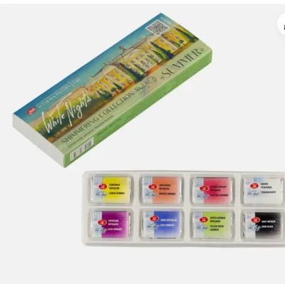
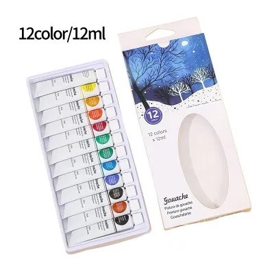
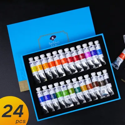
Prices are valid at publication and may change. Please refer to the product page for the latest price.
When evaluating starter sets, you will generally encounter two distinct tiers of quality. Understanding the differences between these grades will help you decide where to allocate your budget and what to expect from your materials.
Student-Grade vs. Professional-Grade
Student-grade paint sets are specifically formulated to be cost-effective and highly forgiving for those who are just learning the basics of colour theory and brush control. To keep prices accessible, manufacturers replace rare or expensive organic pigments with synthetic “hues”—blends of cheaper pigments designed to mimic the appearance of costly minerals like cobalt or cadmium. While student-grade paints have a lower pigment concentration and a higher proportion of fillers, they are excellent for practice. They allow you to work on large-scale exercises, swatch colours, and make mistakes without the pressure of wasting expensive materials.
Professional-grade sets, often labelled as “artist-grade,” contain the highest possible pigment load with minimal fillers. The pigments are ground to an optimal particle size, resulting in exceptional vibrancy, smooth flow, and superior mixing capabilities. When you blend professional-grade paints, the colours remain clean and bright rather than turning grey or muddy. While these sets command a higher price, they are highly concentrated, meaning a tiny dab of paint goes a long way. For beginners who want to produce archival work that will not degrade over time, investing in a small, high-quality professional starter set is often more rewarding than buying a large student-grade kit.
Reading Lightfastness and Pigment Labels
To truly understand what is inside a tube of paint or a bottle of ink, you must learn to read the fine print on the manufacturer’s label. Reputable brands print specific codes that indicate the exact pigments used and their resistance to fading.
- Pigment Identification Codes: Look for codes like PB29 (Pigment Blue 29, which is Ultramarine) or PY150 (Pigment Yellow 150, a nickel azo yellow). A single-pigment paint lists only one code on the label. Single pigments are highly desirable for beginners because they mix predictably. If a tube lists three or four pigment codes, it is a "convenience mix." While convenient out of the tube, mixing multiple pre-blended colours together quickly leads to muddy, dull results.
- Lightfastness Ratings: Lightfastness refers to a pigment's ability to resist fading or shifting colour when exposed to light over time. The American Society for Testing and Materials (ASTM) rates pigments from ASTM I (Excellent Lightfastness) to ASTM V (Very Poor Lightfastness). Alternatively, some brands use the Blue Wool Scale, which ranges from 1 (very poor) to 8 (outstanding). For artwork intended to last, stick to paints rated ASTM I or II, or Blue Wool 6 through 8.
Evaluating Colour Range and Palette Versatility
It is incredibly tempting for beginners to purchase starter sets containing 36, 48, or even 72 different colours. The visual appeal of a massive rainbow of tubes is undeniable, but these oversized sets can actually hinder your artistic development. When you have a pre-mixed tube for every conceivable shade, you miss out on the crucial learning process of colour mixing. Furthermore, cheap, massive sets often rely on low-grade convenience mixes that look dull when layered or blended. A smaller, carefully curated palette of 6 to 12 high-quality colours is far more versatile and educational.

A well-balanced starter set should be built around a split-primary system. In theory, red, yellow, and blue can mix any colour in the spectrum. In practice, however, physical pigments carry a “colour bias,” meaning they lean either warm or cool. For example, Ultramarine Blue leans toward red (warm), while Phthalo Blue leans toward green (cool). If you mix a warm blue with a warm yellow (which leans toward orange), you will get a duller, more earthy green because of the red undertones. To mix vibrant secondary colours, your starter set should ideally include both a warm and a cool version of each primary colour:
- Yellows: A cool yellow (such as Lemon Yellow) and a warm yellow (such as Hansa Yellow Medium or New Gamboge).
- Reds: A cool red (such as Quinacridone Magenta or Alizarin Crimson) and a warm red (such as Pyrrole Red or Cadmium Red Light).
- Blues: A cool blue (such as Phthalo Blue) and a warm blue (such as Ultramarine Blue).
In addition to the primaries, a solid starter set should include a few earth tones, such as Burnt Sienna or Yellow Ochre, which are difficult to mix from scratch and are essential for grounding your paintings.
Beyond colour selection, pay close attention to the opacity and transparency levels indicated on the packaging. This is usually represented by a small icon, such as a square. An empty square denotes a fully transparent colour, a diagonal line through the square indicates semi-transparent, and a solid black square represents fully opaque. Transparent colours are vital for glazing, layering, and watercolour techniques, as they allow light to pass through the paint and reflect off the paper. Opaque colours, such as gouache or heavy-body acrylics, provide solid coverage and are excellent for blocking in large shapes or adding highlights over dark backgrounds.
Assessing Included Tools and Medium Compatibility
Many beginner starter sets are marketed as complete kits, bundling paints or inks with brushes, mixing palettes, and paper. While these all-in-one bundles offer convenience, the quality of the included accessories can vary wildly. It is essential to evaluate whether these extra tools add genuine value or if they are cheap additions that will frustrate your practice.
Essential Tools to Look For
When reviewing a bundled starter set, examine the specifications of the included tools. Low-quality accessories can ruin the experience of working with even the finest paints.
- Brushes: Many budget kits include cheap synthetic brushes with stiff, plastic bristles. These brushes fail to hold a proper amount of water or paint, lose their shape after a single use, and frequently shed synthetic hairs directly into your wet artwork. Look for sets that include high-quality synthetic fibers, such as golden taklon, which mimic the spring and water-holding capacity of natural hair without the high cost.
- Palettes: A good mixing palette should have deep wells for liquid media and a flat mixing area. Cheap, thin plastic palettes can stain permanently and cause water-based paints to bead up, making it difficult to see the actual colour you are mixing. Sturdier, textured plastic or ceramic palettes are much easier to work with.
- Droppers and Nibs: If you are purchasing an artist ink set, check if the bottles feature built-in glass eye-droppers. These are incredibly useful for transferring precise amounts of ink to your palette without making a mess. For calligraphy or drawing ink sets, ensure any included dip pen nibs are made of flexible, polished steel that glides smoothly across the paper rather than scratching the surface.
Matching Inks and Paints to Paper
No matter how high the quality of your starter set, the final result depends heavily on the surface you paint on. Using the wrong paper can cause warping, bleeding, and dull colours.
Water-based paints and inks, including watercolours, gouache, and acrylic washes, require heavy, absorbent paper. Standard printer paper or cheap sketchbooks will buckle and tear when exposed to moisture. For water-based media, look for paper with a minimum weight of 300 gsm (140 lb). Additionally, pay attention to the “sizing” of the paper. Sizing is a starch or gelatin treatment applied to the paper fibers that controls how quickly water is absorbed. Properly sized watercolour paper keeps the pigment resting on the surface, allowing for beautiful washes and clean edges, whereas unsized paper acts like blotting paper, soaking up the liquid instantly and leaving dull, fuzzy marks.
Alcohol inks operate on an entirely different physical principle. Because they dry incredibly fast through evaporation rather than absorption, they must be used on non-porous surfaces. If you apply alcohol ink to standard cellulose paper, the ink will sink in immediately, bleed outward, and lose its vibrant, glossy finish. To use alcohol inks successfully, your starter set should be paired with synthetic papers (such as Yupo), ceramic tiles, glass, or metal panels. These slick, non-porous surfaces allow the ink to glide, pool, and blend into the striking, fluid patterns characteristic of the medium.
Navigating Brand Reputation and Safety Labels
When shopping for art supplies, you will encounter hundreds of generic, unbranded starter sets on online marketplaces. While these kits are often incredibly cheap, they carry significant risks. Unbranded sets rarely provide detailed pigment information, lightfastness ratings, or material safety sheets. The formulations can be highly inconsistent, with some tubes arriving completely dried out or containing toxic heavy metals that are not clearly labelled. To ensure a safe and productive experience, it is always best to buy from established, reputable art supply manufacturers.
Established brands have a vested interest in quality control and regulatory compliance. They publish extensive product documentation, including pigment charts and safety data sheets, which are easily accessible on their websites. This transparency allows you to verify exactly what you are putting on your brush and bringing into your home.
Safety is a paramount consideration, especially if you are setting up a creative space in a typical residential apartment in Singapore, where rooms may rely on air conditioning rather than open-window cross-ventilation. Always look for non-toxic safety certifications on the product packaging:
- The AP Seal: The Approved Product (AP) seal from the Art and Creative Materials Institute (ACMI) is the gold standard for art supply safety. It certifies that the product has been toxicologically evaluated and contains no materials in sufficient quantities to be toxic or injurious to humans, including children.
- CL Warning Labels: If a product bears a Cautionary Labelling (CL) seal, it contains ingredients that require careful handling and specific safety precautions. These are common in professional-grade oil paints, solvent-based inks, or certain heavy-metal pigments like cobalt and cadmium.
For home studios with limited ventilation, avoid solvent-based inks and paints. Instead, select water-based, low-odour alternatives that can be cleaned up easily with soap and water. Additionally, check the manufacturer’s specifications regarding the binder type and shelf life. High-quality brands formulate their binders to resist separation and spoilage, ensuring your starter set remains usable for years when stored correctly.
Practical Steps to Test and Verify Your New Set
Once you have purchased your beginner artist ink and paint starter set, do not dive straight into a complex masterpiece. Taking the time to test and verify your new materials through low-risk exercises will help you understand how they behave and ensure there are no manufacturing defects.
Swatching Your Palette
Creating a systematic swatch card is the best way to familiarise yourself with your new colours and verify their quality. Follow these steps to create an informative reference guide:
- Prepare the Paper: Take a sheet of high-quality, heavy-weight paper (ideally 300 gsm) that matches your medium. Use a waterproof black marker to draw a thick, horizontal line across the middle of the page.
- Apply the Paint: For each colour in your set, paint a vertical rectangle that crosses over the black line. Start at the top of the rectangle with a thick, heavy application of paint straight from the tube or bottle.
- Create a Gradient: Gradually dilute the paint with water (or the appropriate medium) as you brush downward, ending in a very light, transparent wash at the bottom of the rectangle.
- Observe the Results: Once dry, examine the swatches. The area over the black line will show you the exact opacity level of each paint. Look at the transition from thick to thin paint to observe the smoothness of the grind and the flow. Note if any colours look chalky, separate into uneven patches (granulation), or shift dramatically in colour as they dry from wet to matte.
Performing a Simple Lightfastness Test
If your starter set does not list official lightfastness ratings, or if you want to verify the manufacturer’s claims, you can conduct a simple, reversible test at home.
Paint two identical swatch cards containing a strip of every colour in your set. Cut the paper in half so you have two identical sets of swatches. Place one half inside a dark drawer, cabinet, or folder where it is completely protected from light. Take the other half and tape it to a sunny, north- or south-facing window that receives direct sunlight. Leave the window swatch in place for 30 to 60 days. After the testing period, retrieve the hidden swatch and place it directly next to the window swatch. Compare the two side-by-side. Any noticeable fading, shifting, or dulling of the colours on the window swatch indicates poor lightfastness, helping you identify which colours in your set should not be used for finished pieces intended for display.
Handling Defective Products
Occasionally, even high-quality brands produce a defective batch. When you first open your starter set, inspect every bottle and tube carefully. Check for signs of excessive separation, where a clear, oily, or watery liquid pours out of the tube while the pigment remains stuck inside as a hard lump. While minor separation is normal and can often be resolved by massaging the tube or stirring the paint, extreme separation that cannot be mixed back together indicates an expired or poorly formulated binder.
If you find cracked caps, broken foil seals, or completely dried-out ink bottles, document the issues immediately with clear photographs. Do not attempt to salvage the product with water, as this can introduce bacteria and lead to mould growth. Instead, review the retailer’s return policy or contact the manufacturer’s customer service directly. Reputable art supply brands are known for their excellent customer support and will typically ship replacement items quickly if a manufacturing defect is verified.
Frequently Asked Questions (FAQ)
Can I mix student-grade and artist-grade paints?
Yes, you can physically mix student-grade and artist-grade paints, provided they share the same binder type (for example, mixing student-grade acrylics with professional-grade acrylics). This is a highly common and cost-effective practice among artists who want to stretch their budget. However, you must keep in mind that mixing the two grades will dilute the high pigment load and archival qualities of the professional-grade paint. The resulting mixture will behave more like a mid-tier student paint, with reduced vibrancy and lower lightfastness. For background washes or large-scale areas where intense colour saturation is not critical, mixing grades is highly effective, but for fine details and vibrant focal points, stick to your professional-grade paints.
How long do unopened ink and paint starter sets last?
Under ideal conditions, unopened water-based paint and ink starter sets typically have a shelf life of 2 to 5 years. However, in Singapore’s hot and highly humid climate, the shelf life of these mediums can be shortened if they are not stored correctly. High humidity can encourage mould growth if spores find their way past a compromised seal, while heat can accelerate the drying and cracking of plastic tubes and bottle caps. To maximise the longevity of your sets, store them in a cool, dark cabinet away from direct sunlight, moisture-heavy areas, and air conditioning vents, which can cause rapid temperature fluctuations. Always ensure caps are screwed on tightly after use, and clean any wet paint or dried crust from the threads of the tube to maintain an airtight seal.
Are alcohol inks and acrylic inks suitable for beginners?
Both alcohol inks and acrylic inks are suitable for beginners, but they offer vastly different handling characteristics and learning curves compared to traditional paints. Acrylic inks are water-based, highly pigmented, and dry to a permanent, water-resistant finish. They are incredibly versatile for layering and mixed-media work, but because they dry permanently, you must clean your brushes immediately to prevent the acrylic binder from ruining the bristles. Alcohol inks, on the other hand, are highly fluid, transparent, and vibrant, making them incredibly fun for creating abstract, organic patterns on non-porous surfaces. However, they dry almost instantly through alcohol evaporation and release strong isopropyl alcohol fumes. If you choose to work with alcohol inks, it is highly recommended to work in a well-ventilated area or use a dedicated respirator mask, making them slightly more demanding in terms of workspace setup than water-based acrylic inks.
Community discussion
Share your experience or ask a question. Comments are reviewed before publication.