
A wall calendar is more than just a tool for tracking dates; it serves as a central visual anchor for your home or workspace. As you prepare for the upcoming year, finding a high-quality wall calendar 2027 that balances functional writing space with exceptional design is essential. In Singapore’s fast-paced environment, a well-placed calendar keeps your daily schedule, family commitments, and work deadlines visible at a single glance.
Choosing the right calendar requires looking beyond beautiful imagery. You must consider how the paper reacts to your favorite pens, how the binding holds up against Singapore’s humid climate, and whether the layout provides enough room for your daily notes. By focusing on material quality, artistic style, and layout practicality, you can select a calendar that keeps you organized and complements your interior decor throughout 2027.
How to Evaluate Wall Calendar Design and Build Quality
Paper Quality and Weight
The foundation of any premium calendar is its paper stock. Standard copy paper is typically around 80 GSM (grams per square meter), which is far too thin for a calendar meant to be written on with various pens. To prevent ink from bleeding through to the next month or feathering across the page, look for a wall calendar with a paper weight of at least 120 GSM to 200 GSM. Uncoated or matte-coated papers within this weight range offer excellent ink absorption and quick drying speeds, which are crucial for preventing smudges.
Products mentioned in this guide
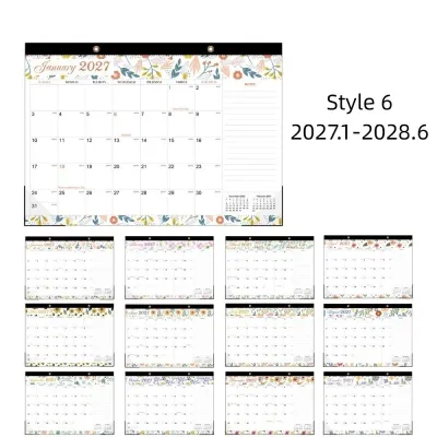
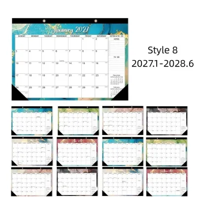
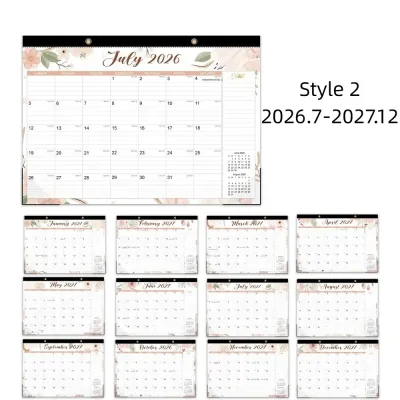
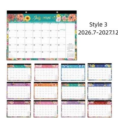
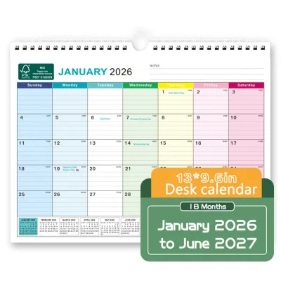
Prices are valid at publication and may change. Please refer to the product page for the latest price.
Because different ink formulations interact uniquely with various paper fibers, it is always wise to perform an observable trial. Before writing down your entire schedule, test your preferred pen, marker, or highlighter on a small, inconspicuous corner of the calendar or on the back cover. Observe how quickly the ink dries and check the reverse side of the page for any signs of ghosting or bleed-through to ensure the medium is a perfect fit for the paper.
Binding and Durability
A wall calendar must remain structurally sound for a full twelve months. The binding method plays a critical role in how flat the calendar hangs and how easily you can flip between months. Twin-ring wire-o binding is highly recommended because it allows the pages to turn a full 360 degrees without creasing or tearing. It also ensures the calendar lies completely flat against the wall, preventing the bottom corners from bowing outward.
In Singapore’s humid tropical climate, paper naturally absorbs moisture from the air, which can lead to warping or curling if the construction is weak. Calendars bound with sturdy metal wire-o spirals and reinforced hanging loops resist this humidity-induced warping much better than stapled (saddle-stitched) or glue-bound alternatives. A dedicated metal hanger loop integrated into the wire binding also distributes the weight evenly, preventing the hanging hole from tearing under the weight of heavy paper stock.
Grid Clarity and Typography
Readability is the primary functional requirement of any wall calendar. The typography should feature clean, high-contrast fonts that are easily legible from across the room. Pay close attention to the visual hierarchy: the month and year should be prominent, followed by clear day-of-the-week labels and distinct date numbers.
A well-designed grid allocates maximum space to the daily blocks while keeping decorative elements minimal. For users in Singapore, verify whether the calendar includes local public holidays directly within the grid or provides a clear, dedicated holiday key. Having these dates pre-printed saves time and prevents scheduling conflicts during major festive periods and long weekends.
Finish and Texture
The tactile finish of the paper dramatically affects both its writeability and how it looks under different lighting conditions. Uncoated paper has a natural, slightly textured feel that is ideal for pencil, ballpoint, and fountain pen users, as it provides excellent traction and prevents ink pooling. Matte-coated paper offers a smoother texture that enhances color vibrancy for illustrations while remaining highly writeable with most gel and rollerball pens.
Avoid calendars with high-gloss finishes on the writing grid. While glossy paper makes photographs look incredibly sharp and vibrant, it is highly reflective and creates distracting glare under bright overhead lights or natural sunlight. Furthermore, glossy surfaces do not absorb water-based inks well, leading to slow drying times, frequent smudging, and a reliance on permanent markers.
Top Design Styles to Look for in 2027 Calendars
Minimalist and Typographic Layouts
Minimalist wall calendars prioritize clean lines, generous white space, and a refined typographic layout. These designs typically feature monochromatic or muted color palettes—such as charcoal, warm beige, soft olive, or classic black and white—and utilize elegant, modern sans-serif or serif typefaces. By stripping away unnecessary illustrations, decorative borders, and distracting colors, minimalist layouts allow your schedule to take center stage.

This style is particularly suited for contemporary home offices, professional workspaces, or minimalist living areas where you want to maintain a calm, clutter-free environment. When evaluating a minimalist calendar, look closely at the grid structure. The lack of heavy borders should not result in a confusing layout; instead, clever use of negative space and subtle alignment marks should guide your eyes naturally across the weeks. An open-grid design with faint dot-matrix patterns is an excellent choice, as it provides a guide for straight writing without compromising the clean, airy aesthetic.
Art-Driven and Illustrated Calendars
For those who view a calendar as a decorative element, art-driven and illustrated designs function as rotating art exhibitions for your wall. Each month reveals a new piece of curated artwork, ranging from vibrant botanical illustrations and abstract watercolor paintings to professional travel photography and local heritage sketches. This style adds personality, color, and inspiration to your living room, kitchen, or creative studio.
When choosing an art-driven calendar, it is vital to evaluate how the design balances artistic expression with practical planning. The most successful layouts use a split-page format, where the artwork occupies the top half of the calendar and a clean, highly legible grid sits on the bottom half. This ensures that the visual impact of the art does not compromise your writing space. Additionally, look for publishers that use high-resolution offset printing and fade-resistant inks, ensuring that the artwork remains vibrant and true-to-life even when hung in rooms with bright, indirect sunlight.
Highly Functional and Grid-Heavy Planners
If you are managing a busy household, coordinating family schedules, or tracking complex professional projects, a highly functional, grid-heavy layout is indispensable. These calendars are specifically engineered to maximize writing space and offer advanced organizational features. Rather than simple blank squares, their grids often include dedicated columns for different family members, integrated weekly to-do lists, and side margins for monthly goal setting.
To assess the utility of a functional planner, measure the daily blocks to ensure they can accommodate your typical volume of daily entries. Look for blocks that feature faint horizontal lines, which help keep your handwriting neat and organized. Many premium functional calendars also include supplementary planning tools, such as a comprehensive yearly overview page for forward planning, moon phases, and color-coded sticker sheets that allow you to highlight doctor appointments, school exams, or project deadlines at a glance.
Where to Find Quality Calendar Brands in Singapore
Local Independent Design Studios
Sourcing your 2027 calendar from Singapore-based independent design studios and boutique creators is an excellent way to find unique, culturally resonant layouts. Local designers often incorporate regional themes, Singaporean heritage motifs, and local flora and fauna into their artwork. Most importantly, these local creators design their grids specifically with the Singapore market in mind, pre-printing local school holidays, public holidays, and regional observances directly onto the pages.
You can discover these independent creators by visiting local design markets, boutique craft fairs, and seasonal pop-up events held in creative hubs across Singapore. Many studios also showcase their work on their own e-commerce websites and social media portfolios. Keep in mind that independent designers typically operate on different timelines than mass-market brands; they often launch pre-orders for their 2027 collections between September and November 2026. Placing a pre-order not only secures your copy of a limited-run design but also supports the local creative community.
Premium Stationery Retailers and Bookstores
If you prefer established international stationery brands or want to compare a wide variety of styles in person, premium bookstores and lifestyle concept stores in Singapore are excellent resources. Major physical bookstores located in central shopping districts like Orchard Road or Bugis carry curated selections of high-end calendars from Japanese, European, and American design houses. Specialty stationery boutiques in areas like Millenia Walk or downtown shopping malls also specialize in importing premium paper products.
Shopping in person offers the irreplaceable advantage of being able to physically handle the calendars. You can run your fingers over the paper to assess its texture, test the stiffness of the backing board, and inspect the binding quality and color accuracy under natural and retail lighting. If you choose to shop via their online storefronts, read the product descriptions carefully to verify if the international brand has been localized with Singapore public holidays. Ensure the retailer has a robust packaging policy; calendars should be shipped flat between thick sheets of protective cardboard or rolled carefully in heavy-duty mailing tubes to prevent creased pages and dented corners during delivery.
How to Choose the Right Layout for Your Planning Needs
Assessing Wall Space and Orientation
Before purchasing a wall calendar, it is essential to measure the exact wall space where you plan to hang it. Wall calendars come in three primary formats: portrait (vertical), landscape (horizontal), and square. Portrait calendars are highly versatile and fit comfortably on narrow walls, columns, or the back of doors. Landscape calendars require wider wall space and look exceptionally balanced when hung above a desk, console table, or sideboard. Square calendars offer a symmetrical, modern look that fits well in compact spaces. Ensure the scale of the calendar matches your wall; a tiny calendar on a massive, empty wall can look lost, while an oversized calendar can overwhelm a small room.
Lighting and Glare Considerations
Take note of the natural and artificial light sources in your chosen room. If you plan to hang the calendar directly opposite a large window that receives bright afternoon sun, or beneath a strong overhead LED light, avoid papers with semi-gloss or glossy finishes. The resulting glare can make the grid lines and your own handwriting completely invisible from certain angles. For rooms with high-intensity lighting, opt for uncoated, matte, or recycled paper finishes, which absorb light rather than reflecting it, ensuring comfortable readability at any time of day.
Matching Grid Size to Writing Habits
Your personal writing style and planning density should directly dictate the grid size you choose. If you write with thick-tipped gel pens, fountain pens, or broad markers, or if you share the calendar with family members who have large handwriting, you will require spacious, open grids with unlined blocks measuring at least 4 cm across. If you write with fine-tip pens and have neat, compact handwriting, a calendar with lined daily blocks or dot-grid patterns will help you maximize the space, allowing you to fit multiple appointments and reminders into a smaller overall footprint.
Accessibility and Placement
To get the most utility out of your wall calendar, hang it at an accessible height. The optimal height for a wall calendar is eye level—typically around 1.5 meters from the floor to the center of the page. This height allows you to read the dates easily from a distance and write new appointments comfortably without having to stretch upward or bend down. Place the calendar in a high-traffic transition area of your home or office, such as near the kitchen entrance, beside the main hallway, or directly adjacent to your primary desk, ensuring it remains a constant, effortless visual reference for your daily planning.
Frequently Asked Questions (FAQ)
When do 2027 wall calendars typically become available in Singapore?
Mass-market brands and major bookstores in Singapore generally begin stocking their 2027 wall calendar inventory in the third quarter of 2026, typically around August or September. Independent local designers, boutique studios, and international specialty brands often launch pre-orders slightly later, between October and November 2026, releasing their stock in limited batches that frequently sell out before the new year begins.
What paper weight is best to prevent marker bleed-through on wall calendars?
To prevent standard ballpoint, gel, or rollerball pens from bleeding through, look for a calendar with a paper weight of at least 100 GSM. If you prefer using heavy water-based markers, highlighters, or wet fountain pen inks, select a calendar featuring uncoated paper of 120 GSM to 160 GSM or higher. To ensure complete compatibility, always perform an observable trial by testing your preferred pen on a small, blank corner of a page before writing on the main grid.
Community discussion
Share your experience or ask a question. Comments are reviewed before publication.