
Selecting the ideal Loka Made greeting card requires matching the brand’s signature whimsical, culturally rich illustrations with the specific emotional tone of your occasion. Known for capturing nostalgic local heritage, architectural marvels, and everyday cultural elements, these cards serve as both a message carrier and a keepsake. To find the best design, you must evaluate the recipient’s personality, the formality of the event, and the physical characteristics of the card itself.
How to Evaluate Card Materials and Finishes for Your Needs
The tactile experience of receiving a card often speaks as loudly as the words written inside. When browsing collections, pay close attention to the paper weight, which is typically measured in grams per square meter (gsm). A sturdy cardstock of 250 gsm to 300 gsm provides a premium, substantial feel in the hand and resists bending during transit. Textured paper, such as felt-marked or linen-finish cardstock, adds an organic, artistic quality that complements hand-drawn illustrations, while smooth matte finishes offer excellent clarity for intricate graphic details.
Special finishes can instantly elevate a card from a simple greeting to a memorable keepsake. Look for options featuring gold or metallic foil stamping, which catches the light beautifully and adds a touch of sophistication suitable for milestone events. Embossing or debossing creates a three-dimensional texture that invites touch, highlighting key design elements like festive borders or elegant typography.
Products mentioned in this guide
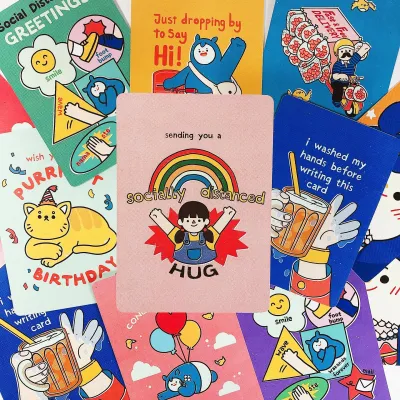
Prices are valid at publication and may change. Please refer to the product page for the latest price.
Do not overlook the envelope, as it represents the recipient’s very first interaction with your message. A high-quality envelope should feel thick and opaque, ensuring the design inside remains a surprise until opened. Some premium cards include envelopes with contrasting inner linings or elegant peel-and-seal adhesive strips, which provide both structural durability and a polished presentation.
Selecting the Perfect Design for Birthdays, Weddings, and Festivals
A card’s visual composition establishes an immediate emotional connection before the envelope is even fully opened. The interplay of color palettes, illustration styles, and typography dictates whether a card feels lighthearted, deeply sentimental, or highly formal. By understanding these design cues, you can easily narrow down your choices to find a card that resonates with the specific spirit of your celebration.

Birthday Cards: Matching the Recipient’s Personality
For birthdays, the design should mirror the unique character of the person celebrating. If you are writing to a close friend or a younger sibling, playful illustrations featuring whimsical local food stalls, bustling street scenes, or humorous cultural caricatures work wonderfully. These designs invite shared laughter and nostalgia, making the card feel highly personal and tailored to your relationship.
When choosing a card for a professional colleague, a mentor, or an older relative, a more refined aesthetic is appropriate. Opt for minimalist architectural sketches, elegant botanical patterns, or classic typography set against a clean, neutral background. These designs convey warmth and respect without feeling overly casual or familiar.
Additionally, check whether the card features a blank interior or a pre-printed message. A blank interior offers the ultimate flexibility, allowing you to write a long, heartfelt note or customize the greeting entirely. Pre-printed messages, on the other hand, are convenient when you want a concise, polished sentiment that lets the cover artwork remain the primary focus.
Wedding Cards: Aligning with Formality and Theme
Wedding cards demand a careful balance of elegance and celebration to match the significance of the couple’s big day. Start by considering the wedding’s overall visual theme and color palette. For a classic, formal ballroom reception, look for cards featuring sophisticated pastel tones, cream backgrounds, and delicate gold foil accents that mirror the grandeur of the venue.
If the couple is hosting a modern, bohemian, or outdoor garden wedding, look for designs that incorporate lush floral motifs, watercolor illustrations, or earthy color schemes. For traditional ceremonies, such as a Chinese tea ceremony or a cultural wedding, cards utilizing rich red and gold tones with subtle heritage patterns pay respect to custom while maintaining a contemporary design edge.
The typography on a wedding card should also reflect the event’s tone. Flowing, elegant script fonts convey romance and timelessness, making them ideal for formal wishes. Clean, modern sans-serif fonts are better suited for contemporary couples who appreciate minimalist design and straightforward, heartfelt expressions.
Festive Cards: Balancing Tradition and Modern Aesthetics
Sending cards during major cultural festivals—such as Lunar New Year, Hari Raya, Deepavali, or Christmas—is a cherished tradition that connects generations. The challenge lies in finding a design that honors cultural heritage while feeling fresh and modern. Look for cards that reinterpret traditional motifs, such as transforming classic festive lanterns, traditional outfits, or seasonal flora into stylized, contemporary illustrations.
When sending festive cards to extended family members, multi-generational appeal is key. Older relatives often appreciate recognizable cultural symbols and traditional greetings, while younger family members enjoy vibrant color palettes and modern graphic layouts. A design that successfully bridges these two worlds ensures your card is warmly received by everyone in the household.
Always verify the cultural appropriateness of the symbols and greetings featured on the card. Ensure that the imagery aligns accurately with the specific festival’s traditions and values. High-quality festive cards often include subtle explanations of the illustrated customs on the back, adding educational value and depth to your seasonal greeting.
Adding Personal and DIY Touches to Elevate Your Message
Transforming a beautiful card into an unforgettable gift involves adding your own creative touches. Because premium cardstock behaves differently than standard writing paper, it is essential to select compatible writing instruments. To prevent ink from bleeding through the paper or feathering along the fibers, avoid using heavy permanent markers or highly liquid fountain pen inks unless you have verified the paper’s absorption rate.
Instead, opt for high-quality gel pens, fine-liners, or pigment-based brush pens. These instruments offer smooth ink flow and dry quickly, which is particularly beneficial in humid climates where moisture can slow down drying times and lead to accidental smudging. Before writing your final message, always perform a quick test stroke on a spare scrap of paper or a hidden corner of the card to observe how the ink behaves on the surface.
To elevate the presentation further, consider incorporating small, reversible DIY embellishments. A strip of patterned washi tape can secure a photo or a gift card inside without tearing the paper fibers when removed. For a touch of old-world charm, apply a wax seal to the back of the envelope, or tuck a small pressed flower or a sprig of dried lavender inside the card to add a subtle, pleasant fragrance.
When structuring your handwritten message, pay attention to the layout and negative space. Rather than crowding the entire page with dense text, leave comfortable margins around your writing to let the paper breathe. Use a simple structure: open with a warm, personalized greeting, share a specific memory or a sincere wish in the center, and close with a meaningful sign-off that complements the card’s visual style.
Navigating Official Channels and Retailers for Authentic Cards
To ensure you are purchasing genuine Loka Made products that feature high-quality printing and authentic artwork, always source your cards through authorized channels. The brand’s official website and physical flagship stores are the most reliable sources for browsing the complete, up-to-date collections. Visiting physical stationery boutiques also allows you to feel the paper texture and inspect the finishes in person before buying.
If you prefer shopping on general online marketplaces or e-commerce platforms, take extra steps to verify the seller’s credentials. Look for official brand stores or authorized retail partners marked with platform verification badges. Read through recent customer reviews, paying close attention to photos uploaded by buyers to confirm that the print quality, paper thickness, and packaging match the brand’s high standards.
Finally, plan your purchases well in advance of major holidays or milestone events. High-demand festive collections can sell out quickly as peak seasons approach. Confirm the seller’s current stock availability and estimated shipping lead times, allowing a buffer of several days to ensure your cards arrive with plenty of time for you to write, decorate, and mail them to your recipients.
Frequently Asked Questions (FAQ)
Can I use a single card design for multiple different occasions?
Yes, many versatile card designs can be adapted for various events. Look for cards that feature minimalist patterns, botanical illustrations, or scenic local landscapes without any pre-printed, occasion-specific text on the cover. By keeping the exterior neutral, you can easily shift the card’s context from a birthday to a thank-you note or a housewarming greeting simply by adjusting your handwritten message inside and choosing a coordinating envelope color.
How do I prevent ink from smudging or bleeding on textured cardstock?
To prevent smudging on textured or coated cardstock, always choose quick-drying pens such as pigment-based fine-liners or specialized gel pens. Avoid using slow-drying rollerball pens or heavy ink markers that can bleed through the paper fibers. After writing your message, leave the card open flat on a clean, dry surface for at least several minutes to allow the ink to cure completely before folding the card or placing it inside the envelope.
Community discussion
Share your experience or ask a question. Comments are reviewed before publication.