
Finding the perfect letter card in Singapore for a heartfelt message requires looking beyond standard greeting cards. While a traditional greeting card often relies on a pre-printed sentiment with minimal space for personal writing, a dedicated letter card prioritizes the written word. It bridges the gap between a brief note and a formal multi-page letter, offering a generous, beautifully framed canvas that honors both your message and the recipient. By focusing on physical characteristics like paper weight, texture, and layout, you can select a card that elevates your handwriting and preserves your sentiments for years to come.
In Singapore’s vibrant stationery scene, choosing the right card involves understanding how different materials interact with your writing instruments. Whether you are writing a letter of gratitude, celebrating a milestone, or offering comfort, the physical presentation of your note sets the emotional tone before the recipient even reads the first word. Taking the time to evaluate these physical details ensures your personal correspondence feels as significant as the relationship it celebrates.
Defining the Ideal Letter Card for Your Message
To choose the right letter card, you must first distinguish it from a standard greeting card. Traditional greeting cards are typically designed for quick, conventional wishes, often featuring large cover illustrations and a pre-printed interior message that leaves only a small blank area for a signature. In contrast, a letter card is designed specifically for long-form, personal correspondence. It provides an expansive, clean writing surface—often utilizing fold-out panels or matching stationery sheets—that allows you to express deep, complex thoughts without crowding your handwriting.
Products mentioned in this guide
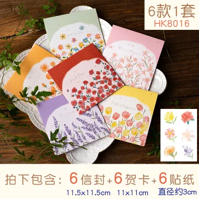


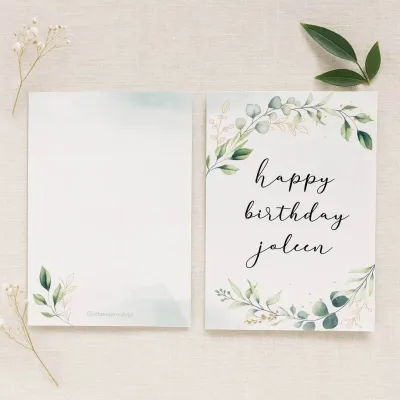
Prices are valid at publication and may change. Please refer to the product page for the latest price.
Matching the card to the emotional tone of your message is the next step in your selection process. A deeply personal letter, such as a message of condolence or a landmark anniversary note, demands a structured, formal presentation with understated elegance. Conversely, a casual note of appreciation or a cheerful update to a close friend can accommodate playful illustrations, vibrant colors, and unconventional layouts. Understanding the length and gravity of your message helps you narrow down the appropriate format, ensuring the card’s physical design harmonizes with your words.
Before browsing local boutiques or online collections, establish a clear set of decision criteria. The primary factors to consider include the paper quality, the physical dimensions, the interior layout, the overall design aesthetic, and whether a matching envelope is included. By keeping these elements in mind, you can avoid the frustration of purchasing a beautiful card only to find that the paper feathers under your fountain pen or the writing space is too small for your message.
Evaluating Paper Quality and Writing Experience
Paper quality is the foundation of any exceptional writing experience. The easiest way to assess this is by checking the paper weight, measured in grams per square meter (GSM). For a premium letter card, look for a weight between 120 GSM and 300 GSM. Cards on the lighter end of this spectrum (120 to 150 GSM) are highly flexible and excellent for multi-page letter inserts, while heavier cardstocks (200 to 300 GSM) provide a sturdy, luxurious feel that stands upright on a mantelpiece. High-GSM paper prevents ink from bleeding through to the back, allowing you to write on both sides of the page.

The texture of the paper significantly influences how your pen glides across the surface. Smooth, highly calendered papers are ideal for gel pens, rollerballs, and fine-liners, as they offer minimal resistance and allow for quick, effortless writing. Laid papers, which feature fine parallel lines from the manufacturing process, and heavily textured or deckled-edge papers provide a rich, tactile experience. These textured surfaces are particularly compatible with fountain pens and dip pens, as the porous fibers grab the ink, creating beautiful variations in shading and line width.
Always check the manufacturer’s specifications or product labels for ink compatibility and surface coatings. Some mass-produced cards feature a glossy or heavily coated interior finish designed to protect the printed artwork. However, these coatings resist water-based inks, leading to pooling, smudging, and incredibly slow drying times. For handwritten letters, uncoated, matte, or lightly sized papers are highly recommended because they absorb ink quickly and cleanly, preserving the sharp edges of your handwriting.
If you are using a specialized writing instrument, such as a wet-flowing fountain pen or a calligraphy brush, it is wise to perform a quick test before writing your final message. If the card does not come with a spare scrap of the same paper stock, find a small, inconspicuous area—such as the very bottom edge of the back cover or the inside fold—to test your pen. Observe the paper for feathering, where the ink spreads sideways along the fibers, or ghosting, where the shadow of the writing is visible on the reverse side. This simple check ensures your final letter remains clean and legible.
Selecting the Right Size and Layout
Selecting the appropriate dimensions for your letter card ensures your message fits naturally on the page. Common sizes include A5 (148mm x 210mm), which offers a generous canvas perfect for long-form letters, and A6 (105mm x 148mm), a classic, compact size ideal for concise, heartfelt notes. Another elegant option is the DL format (99mm x 210mm), which presents a sleek, modern silhouette that fits perfectly into standard business-style envelopes. Choosing a size that matches your natural handwriting size and message length prevents you from having to awkwardly cram your words at the bottom of the card.
The interior layout of the card should support your writing style and structural needs. Blank interiors offer complete creative freedom, allowing you to write at any angle or include small sketches, though they require a steady hand to keep your lines straight. Lined layouts provide subtle, printed guides that keep your handwriting neat and organized, making them excellent for longer narratives. Dotted grids offer a modern compromise, providing structure without the visual clutter of solid lines, while half-printed layouts feature decorative borders that frame your text beautifully.
Consider how the card folds, as this mechanism dictates the rhythm of the reading experience. A classic single-fold card opens like a book, presenting your message all at once. A gate-fold card opens from the center outward, creating a sense of anticipation and ceremony as the recipient unfolds the panels. For a highly traditional feel, a letter-style tri-fold card folds into itself, mimicking the historical style of personal letters and keeping your writing private until it is fully opened. Choose a folding style that complements the narrative flow of your message.
Finally, always verify that the card comes with a matching, properly sized envelope. The envelope should be slightly larger than the folded card—typically offering about 3mm to 5mm of clearance on all sides—to allow the card to slide in and out smoothly without catching or bending the corners. If you plan to mail the card, ensure the envelope is constructed from a sturdy paper weight (at least 100 GSM) to protect your heartfelt message from the rigors of transit.
Matching Design Aesthetics to the Occasion
An effective letter card design should visually echo the emotions carried within your message. Minimalist designs, featuring clean typography and generous negative space, convey a sense of modern sincerity and quiet sophistication. Floral and botanical illustrations evoke warmth, growth, and celebration, making them highly suitable for birthdays, weddings, or expressions of gratitude. Typographic covers place the focus entirely on a beautifully rendered phrase, while abstract designs offer an artistic, open-ended aesthetic that can suit almost any occasion.
While cover art is important, it must never compromise the readability of your interior message. Avoid cards that feature dark, busy, or heavily patterned interior backgrounds, as these elements compete with your handwriting and make reading difficult. If you do choose a card with a dark interior, you will need to adapt your writing tools, opting for specialized opaque gel pens in metallic gold, silver, or white to ensure your words stand out clearly against the deep background.
Physical finishes add a tactile dimension that elevates the overall quality of the card. Foil stamping introduces a subtle, metallic shimmer that catches the light beautifully, while embossing and debossing create raised or recessed textures that invite the recipient’s touch. For an artisanal, heritage feel, look for cards with deckled edges, which mimic the natural, uneven borders of handmade paper. These premium finishes signal to the recipient that the card itself is a keepsake worth holding onto.
If standard pre-printed designs do not perfectly capture your relationship or the specific occasion, consider a modular or DIY approach. You can purchase high-quality, blank card stocks made from premium cotton paper and customize them yourself. Elevate the presentation by adding a hand-poured wax seal to the envelope, tying a delicate silk ribbon around the card, or using custom rubber stamps to create a bespoke border. This personal touch shows an extra level of care and creativity that enhances the emotional impact of your message.
Where to Source and Verify Quality Letter Cards
To find the finest letter cards in Singapore, visiting physical retail locations is highly recommended. Specialty stationery stores, local paper craft boutiques, and museum gift shops—particularly those located in the Civic District or downtown shopping enclaves—offer an unparalleled tactile shopping experience. Visiting these brick-and-mortar shops allows you to physically feel the weight of the cardstock, run your fingers over the paper texture, and inspect the printing quality in person. This hands-on evaluation is the most reliable way to ensure the paper meets your standards before making a purchase.
When shopping online via e-commerce platforms or independent stationery websites, you must rely on careful digital verification. Always read the product descriptions thoroughly, looking for explicit details regarding paper weight (GSM), paper type (such as cotton blend or wood-free), and dimensions. Browse through customer reviews, paying close attention to comments regarding ink bleeding, paper thickness, and packaging quality. User-submitted unboxing photos are incredibly valuable, as they often reveal the true colors and textures of the paper far better than stylized studio photography.
Supporting independent local illustrators and paper designers is an excellent way to find unique, high-quality letter cards. When purchasing from independent creators, look for details about their production methods, such as letterpress, risograph, or high-grade digital printing on archival paper. These small-batch production methods often utilize superior paper stocks and richer inks than mass-market alternatives, resulting in a distinctive, high-character product that makes your message feel even more exclusive.
Given Singapore’s highly humid climate, proper storage and shipping protection are essential for delicate paper goods. When ordering online, verify that the retailer packages their cards in rigid, bend-proof mailers and moisture-resistant protective sleeves. Once your cards arrive, store them in a cool, dry place, ideally inside an airtight container or with a small silica gel packet. This prevents the paper from absorbing ambient moisture, which can cause warping, yellowing, and increased ink feathering over time.
Frequently Asked Questions (FAQ)
How do I prevent ink from smudging on textured letter cards?
To prevent ink from smudging on textured or highly porous letter cards, it is crucial to match your writing instrument to the paper surface. Quick-drying gel pens, fine-liners, and classic ballpoint pens are excellent choices for textured paper because their inks dry rapidly upon contact, minimizing the risk of smearing. If you prefer using a fountain pen, opt for a fine or extra-fine nib paired with a dry-flowing, water-based ink to prevent the ink from pooling in the paper’s textured grooves.
Additionally, place a clean sheet of blotting paper or a smooth piece of scrap paper under your writing hand as you move across the card. This simple barrier prevents the natural oils from your skin from transferring to the paper, which can create slick spots that resist ink. Finally, always allow the card to sit open in a dry environment for several minutes after writing to ensure the ink has completely set before you fold the card or slide it into its envelope.
Can I mail a letter card without an envelope?
Mailing a letter card without an envelope, often referred to as sending a self-mailer, is possible but comes with specific postal requirements and significant risks. Local postal guidelines typically require self-mailers to meet strict minimum standards for paper thickness, size, and aspect ratio to ensure they can pass through automated sorting machines without tearing. Furthermore, the card must be securely sealed on all open edges using clear, non-damaging adhesive tabs or stickers to prevent it from opening during transit.
However, sending an unprotected card exposes it to edge damage, dirt, scuffs, and potential tearing from postal machinery. It also compromises the privacy of your heartfelt message, leaving your personal words visible to anyone handling the mail. To ensure your letter card arrives in pristine, readable condition, it is highly recommended to use a sturdy, properly sized protective envelope or a rigid mailer.
What is the difference between a letter card and a standard greeting card?
The primary difference between a letter card and a standard greeting card lies in their intended function and design layout. A standard greeting card is designed for brief, conventional sentiments. It typically features a prominent cover illustration, a pre-printed message inside, and very limited blank space, making it suitable for quick signatures or short well-wishes. These cards are designed primarily to be displayed on a shelf rather than read as an extended piece of writing.
A letter card, on the other hand, is engineered specifically to accommodate long-form, handwritten correspondence. It prioritizes writing space, featuring blank, lined, or dotted interior panels that fold out to provide a generous canvas. The paper stock used for letter cards is often selected for its high ink compatibility and tactile quality, catering to stationery enthusiasts who enjoy the physical act of writing. Choose a letter card when you want to share a deeply personal, detailed, or meaningful message that requires more than a few sentences.
Community discussion
Share your experience or ask a question. Comments are reviewed before publication.